shaffex
Label is a view that combines a text view with an icon view, providing a user interface element that can display both text and an image side by side. It is commonly used to represent actions, content, or to communicate the status of something in a concise and visually informative way.
Parameters:
systemImage (optional) Name of the SF symbol
name (optional) Name of image embedded in assets
Examples
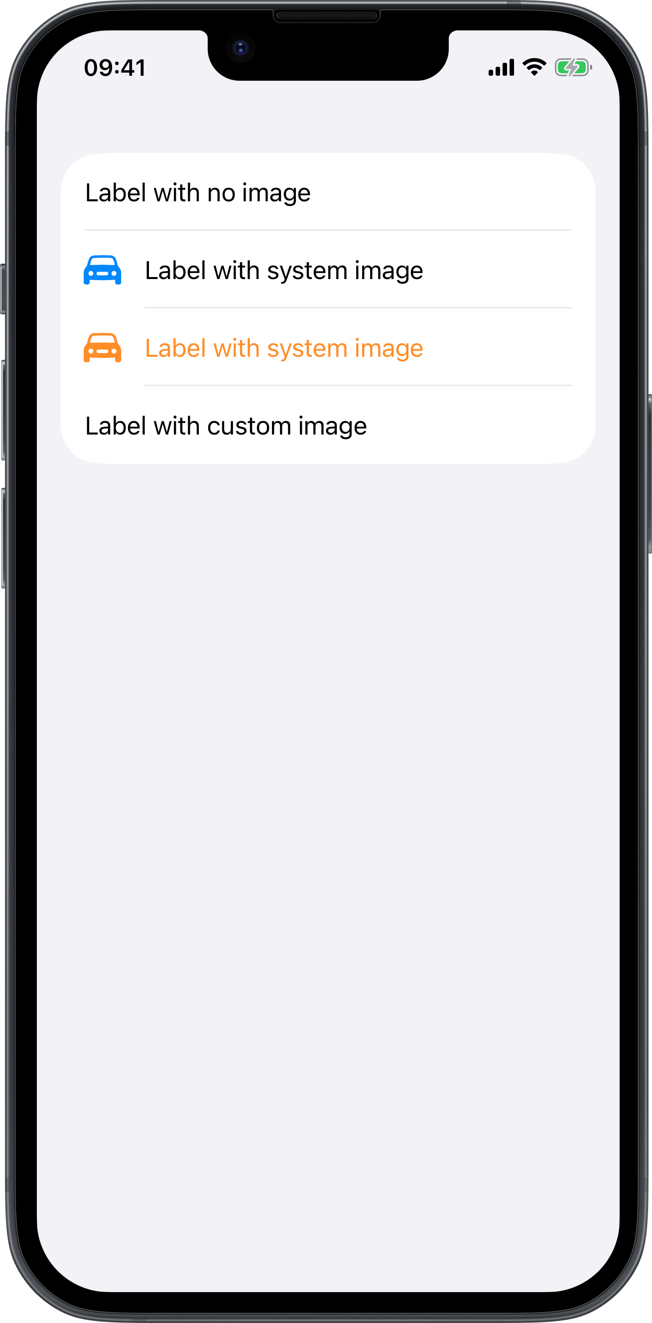
<body>
    <form>
        <label>Label with no image</label>
        <label systemImage="car.fill">Label with system image</label>
        <label foregroundColor="orange" systemImage="car.fill">Label with system image</label>
        <label image="noob2-30x30">Label with custom image</label>
    </form>
</body>
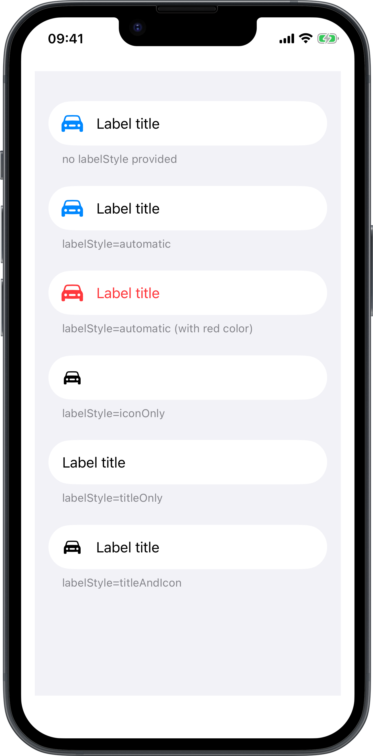
Label with labelStyle
<body>
    <list padding="">
        <section footer="no labelStyle provided">
            <label systemImage="car.fill">Label title</label>
        </section>
        <section footer="labelStyle=automatic">
            <label labelStyle="automatic" systemImage="car.fill">Label title</label>
        </section>
        <section footer="labelStyle=automatic (with red color)">
            <label foregroundColor="red" labelStyle="automatic" systemImage="car.fill">Label title</label>
        </section>
        <section footer="labelStyle=iconOnly">
            <label labelStyle="iconOnly" systemImage="car.fill">Label title</label>
        </section>
        <section footer="labelStyle=titleOnly">
            <label labelStyle="titleOnly" systemImage="car.fill">Label title</label>
        </section>
        <section footer="labelStyle=titleAndIcon">
            <label labelStyle="titleAndIcon" systemImage="car.fill">Label title</label>
        </section>
    </list>
</body>