shaffex
Button is a user interface component that triggers an action when tapped by the user. It can display text, an icon, or both, and it’s highly customizable. In SwiftUI, a Button is a user interface control that performs an action when tapped by the user. It can contain text, an image, or both, and you can customize its appearance and behavior.
Parameters:
action is the action executed when the button is tapped. For more details see Actions
role (optional) is used to semantically indicate the purpose of a button, such as whether it performs a destructive action or is a cancel button. This semantic information can be used by the system to adjust the button’s appearance accordingly and to provide appropriate accessibility features.
noneDefault button behaviourdestructiveIndicates that the action performed by the button is irreversible or could lead to data loss. This role is used to warn users about the potential consequences of their action. The system may also use this semantic information to style the button accordingly, often with a red color, to signal its destructive nature to the user.cancelIndicates that the action performed by the button will dismiss a view or cancel the current operation without making any changes. This role is particularly useful in dialogues or modal views where you have actions like “Cancel” or “Dismiss” that allow the user to opt-out of a process without proceeding further. The system may use this semantic information to style the button appropriately or to handle the button action in a way that’s consistent with cancel operations across the OS.
Note: If you don’t specify any
role, default value isnone
Examples
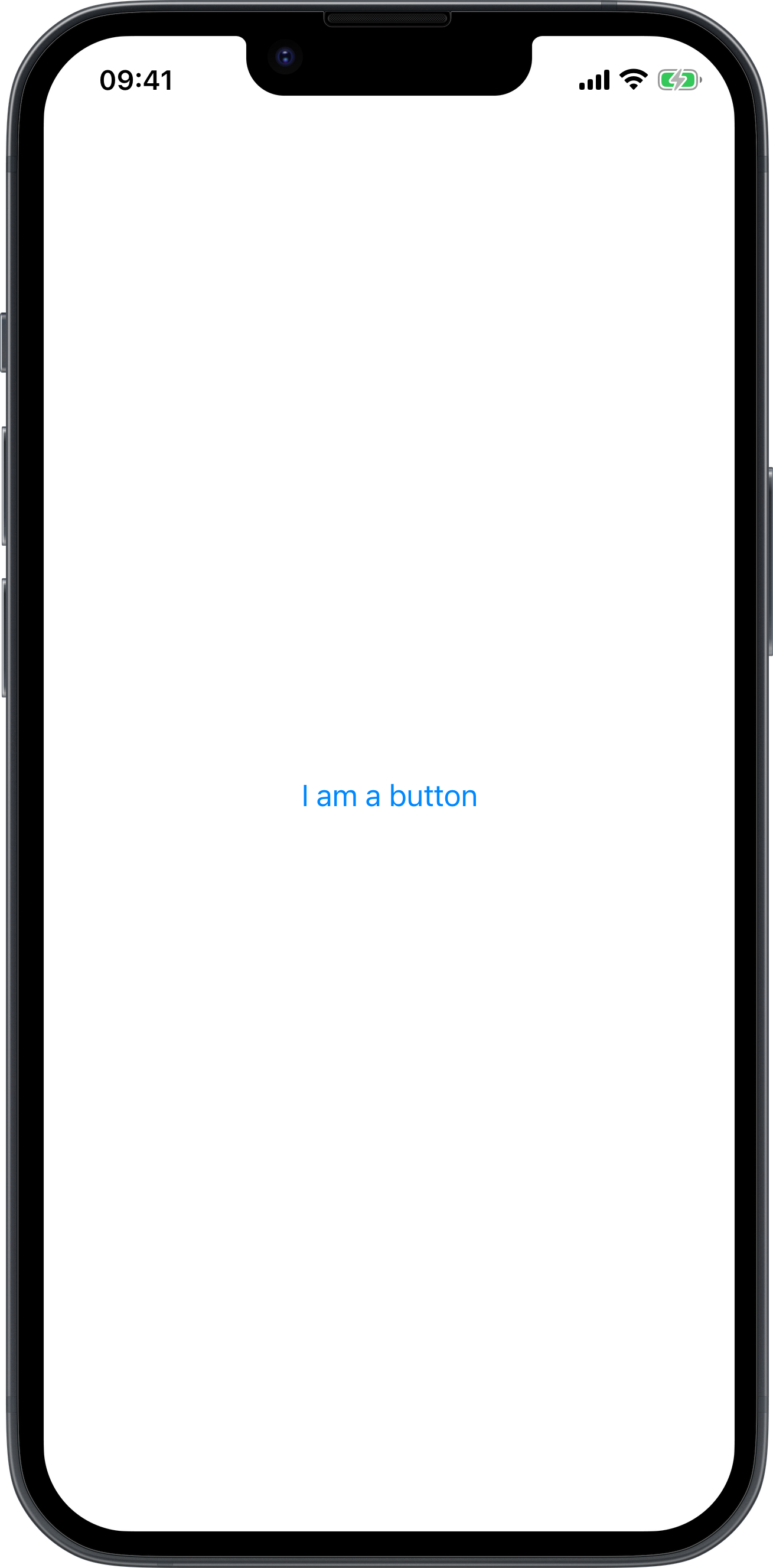
Simple Button
<body>
    <button>I am a button</button>
</body>
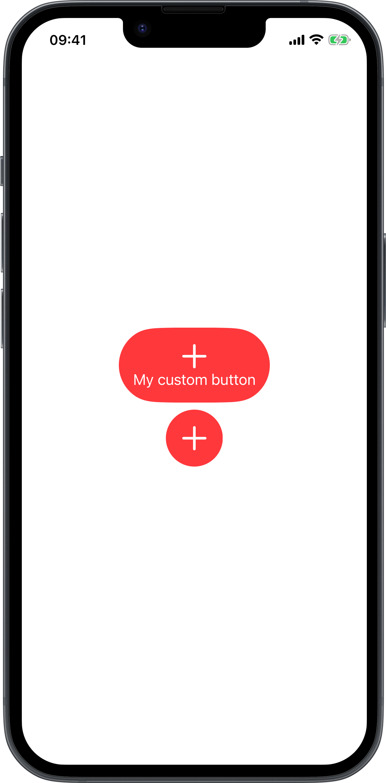
Button with custom view
<body>
    <vstack>
        <button>
            <vstack padding="" background="red" clipShape="capsule" foregroundColor="white">
                <image systemName="plus" font="largeTitle"/>
                <text>My custom button</text>
            </vstack>
        </button>
        <button padding="" background="red" clipShape="circle">
            <vstack foregroundColor="white">
                <image systemName="plus" font="largeTitle"/>
            </vstack>
        </button>
    </vstack>
</body>
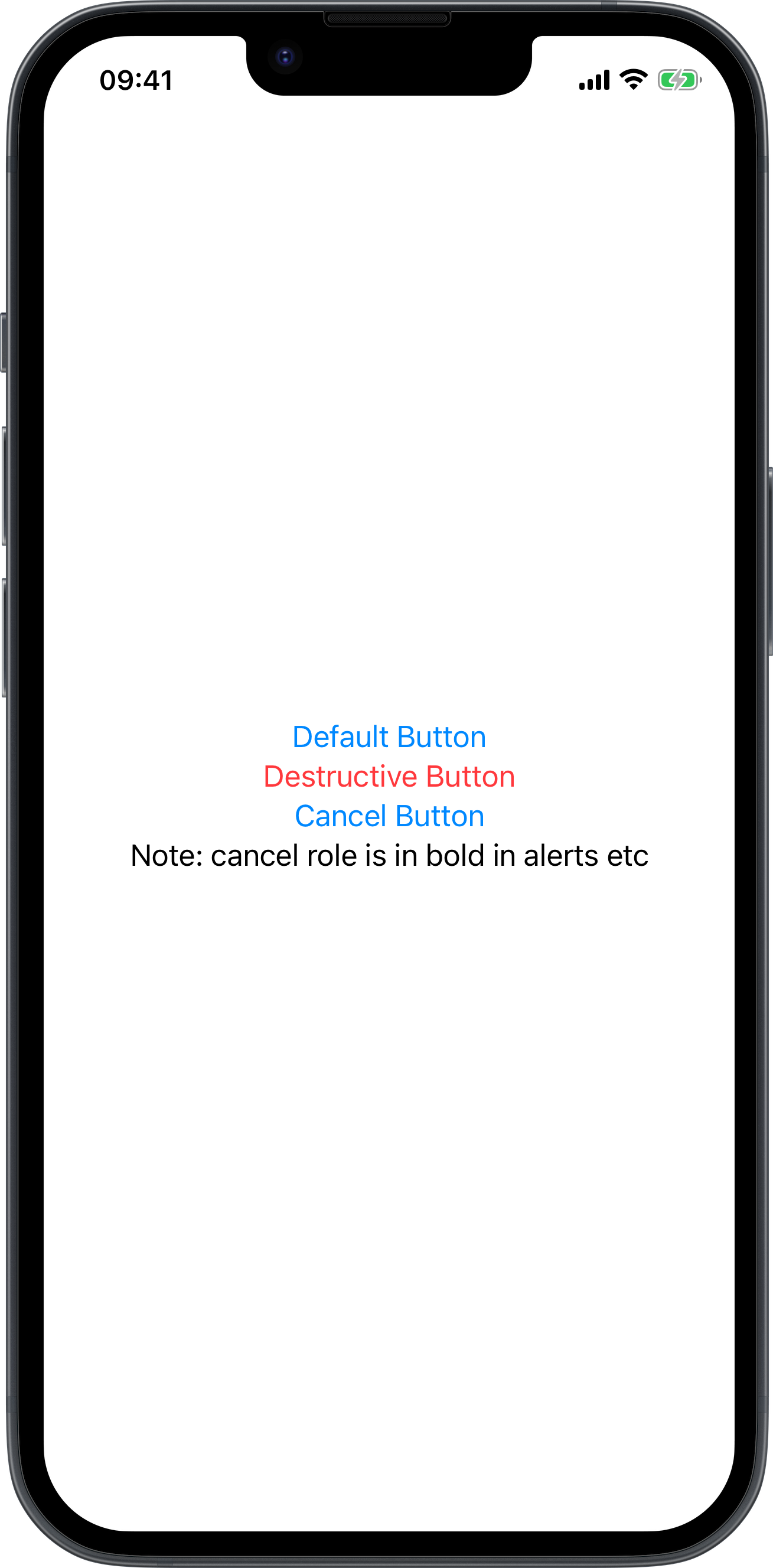
Button with role
<body>
    <vstack>
        <button>Default Button</button>
        <button role="destructive">Destructive Button</button>
        <button role="cancel">Cancel Button</button>
        <text>Note: cancel role is in bold in alerts etc</text>
    </vstack>
</body>
Alert with cancel and destructive buttons
<body>
    <emptyview alert="isPresented:myAlert" onAppear="presentAlert:isPresented:myAlert">
	</emptyview>
    <alert id="myAlert" alertTitle="Warning" alertMessage="Do you want to delete all files?">
        <button role="destructive">Destructive</button>
        <button role="cancel">Cancel</button>
    </alert>
</body>
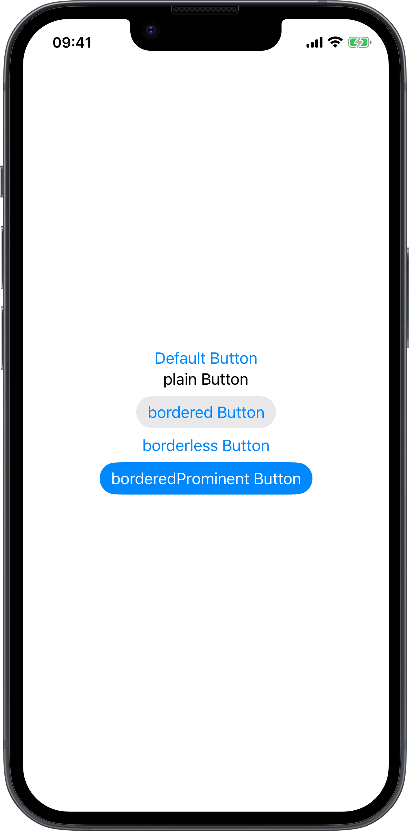
Button with buttonStyle
<body>
    <vstack>
        <button>Default Button</button>
        <button buttonStyle="plain">plain Button</button>
        <button buttonStyle="bordered">bordered Button</button>
        <button buttonStyle="borderless">borderless Button</button>
        <button buttonStyle="borderedProminent">borderedProminent Button</button>
    </vstack>
</body>
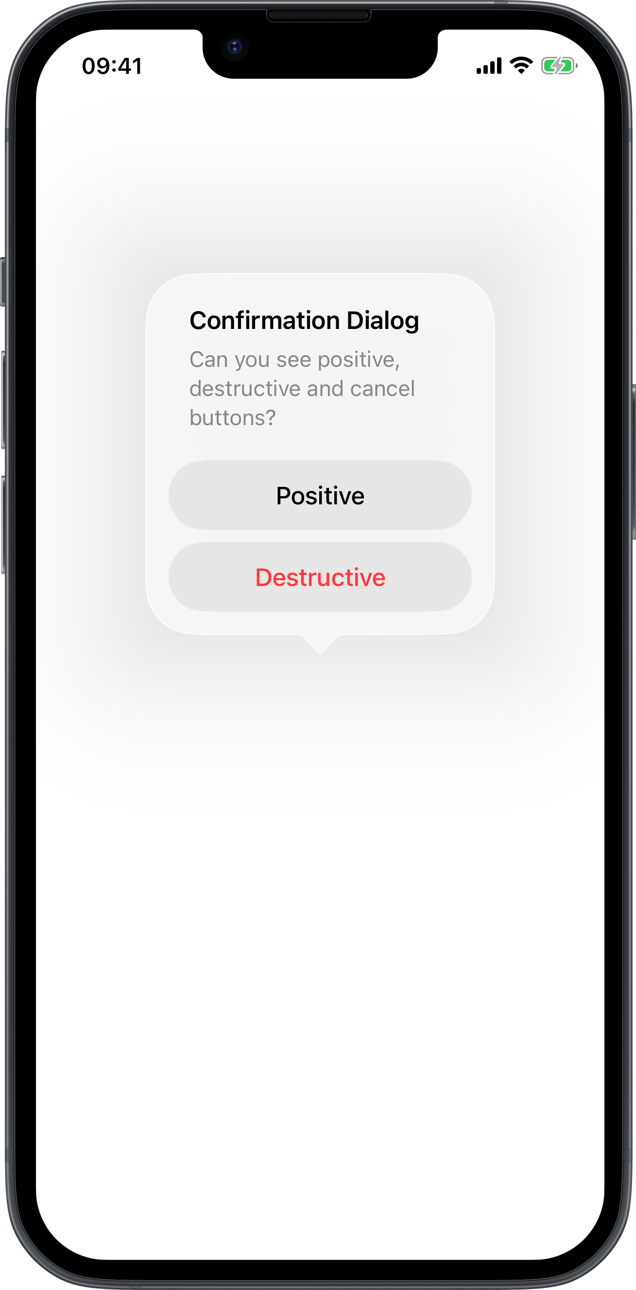
Confirmation dialog with positive, destructive and cancel buttons
<body>
    <vstack confirmationDialog="isPresented:myConfirmationDialog" onAppear="presentConfirmationDialog:isPresented:myConfirmationDialog"/>
    <alert id="myConfirmationDialog" alertTitle="Confirmation Dialog" alertMessage="Can you see positive, destructive and cancel buttons?">
        <button role="">Positive</button>
        <button role="destructive">Destructive</button>
        <button role="cancel">Cancel</button>
    </alert>
</body>