shaffex
Controls
button
Button is a user interface component that triggers an action when tapped by the user. It can display text, an icon, or both, and it’s highly customizable. In SwiftUI, a Button is a user interface control that performs an action when tapped by the user. It can contain text, an image, or both, and you can customize its appearance and behavior.
Parameters:
action is the action executed when the button is tapped. For more details see Actions
role (optional) is used to semantically indicate the purpose of a button, such as whether it performs a destructive action or is a cancel button. This semantic information can be used by the system to adjust the button’s appearance accordingly and to provide appropriate accessibility features.
noneDefault button behaviourdestructiveIndicates that the action performed by the button is irreversible or could lead to data loss. This role is used to warn users about the potential consequences of their action. The system may also use this semantic information to style the button accordingly, often with a red color, to signal its destructive nature to the user.cancelIndicates that the action performed by the button will dismiss a view or cancel the current operation without making any changes. This role is particularly useful in dialogues or modal views where you have actions like “Cancel” or “Dismiss” that allow the user to opt-out of a process without proceeding further. The system may use this semantic information to style the button appropriately or to handle the button action in a way that’s consistent with cancel operations across the OS.
Note: If you don’t specify any
role, default value isnone
Examples
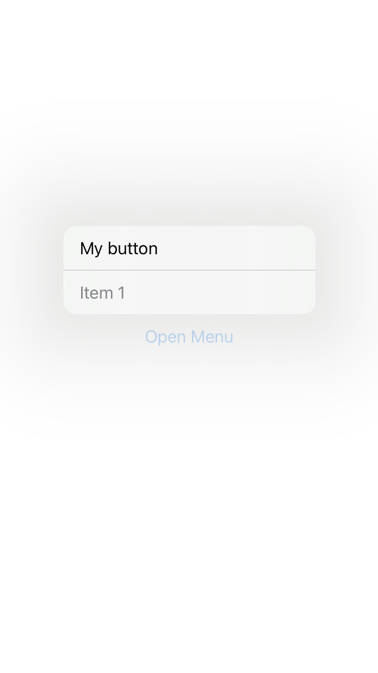
Confirmation dialog with positive, destructive and cancel buttons
<body>
  <vstack confirmationDialog="isPresented:myConfirmationDialog" onAppear="presentConfirmationDialog:isPresented:myConfirmationDialog"/>

  <alert id="myConfirmationDialog" alertTitle="Confirmation Dialog" alertMessage="Can you see positive, destructive and cancel buttons?">
    <button role="">Positive</button>
    <button role="destructive">Destructive</button>
    <button role="cancel">Cancel</button>
  </alert>
</body>

123
<body>
    <button>Press Me 2</button>
</body>

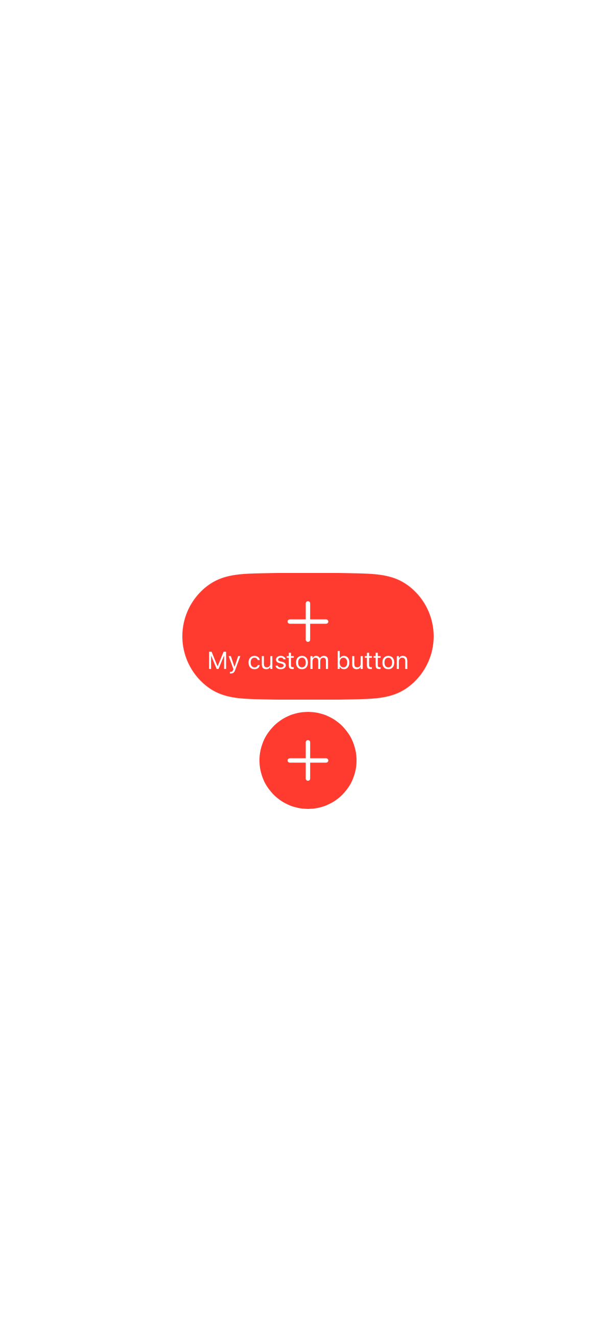
Button with custom view
<body>
	<vstack>
	<button>
		<vstack padding="" background="red" clipShape="capsule" foregroundColor="white">
			<image systemName="plus" font="largeTitle"/>
			<text>My custom button</text>
		</vstack>
	</button>

	<button  padding="" background="red" clipShape="circle">
		<vstack foregroundColor="white">
			<image systemName="plus" font="largeTitle"/>
		</vstack>
	</button>
	</vstack>
</body>
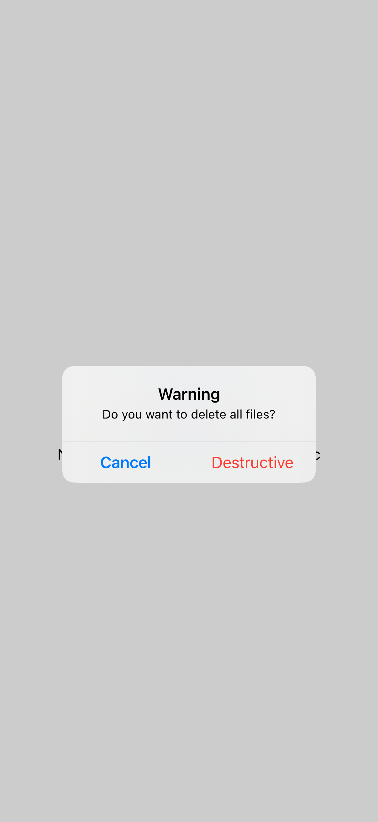
Button with role
<body>
	<vstack alert="isPresented:myAlert" onAppear="presentAlert:isPresented:myAlert">
	<button>Default Button</button>
	<button role="destructive">destructive Button</button>
    <button role="cancel">cancel Button</button>
    <text>Note: cancel role is in bold in alerts etc</text>
    </vstack>

    <alert id="myAlert" alertTitle="Warning" alertMessage="Do you want to delete all files?">
    <button role="destructive">Destructive</button>
    <button role="cancel">Cancel</button>
    </alert>
</body>
Alert with cancel and destructive buttons
<body>
	<emptyview alert="isPresented:myAlert" onAppear="presentAlert:isPresented:myAlert">
	</emptyview>

    <alert id="myAlert" alertTitle="Warning" alertMessage="Do you want to delete all files?">
    <button role="destructive">Destructive</button>
    <button role="cancel">Cancel</button>
    </alert>
</body>

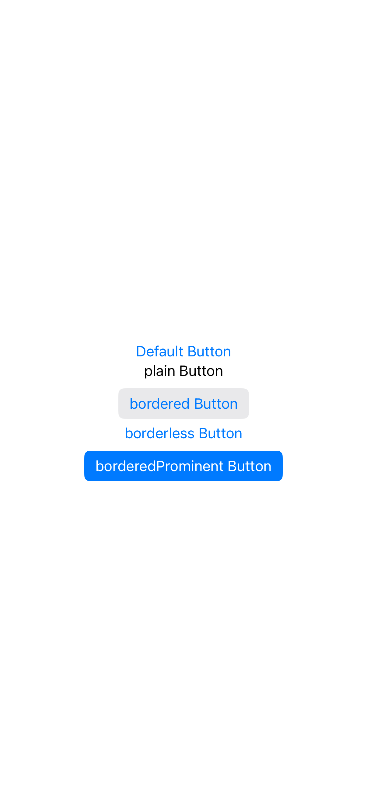
Button with buttonStyle
<body>
	<vstack>
	<button>Default Button</button>
	<button buttonStyle="plain">plain Button</button>
    <button buttonStyle="bordered">bordered Button</button>
    <button buttonStyle="borderless">borderless Button</button>
    <button buttonStyle="borderedProminent">borderedProminent Button</button>
    </vstack>
</body>
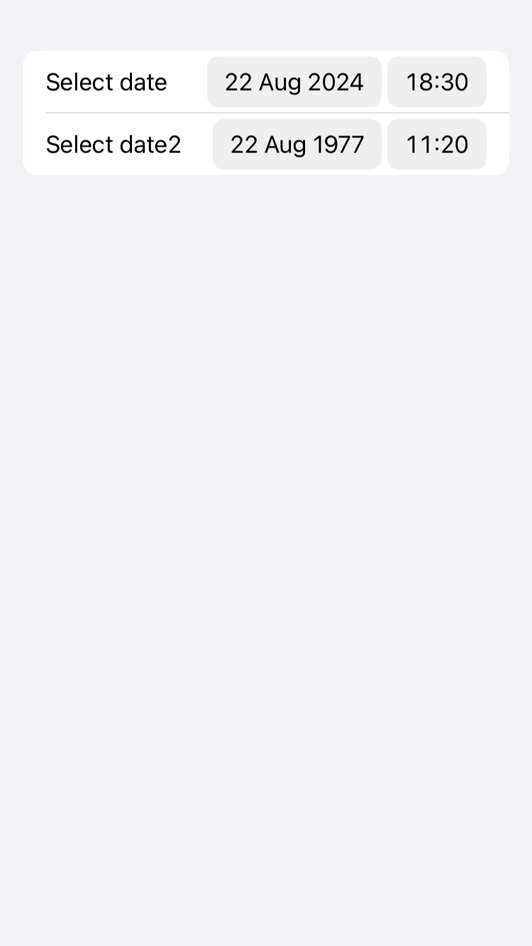
datepicker
datepicker is a container that stacks its children vertically.
<body>
    <form>
    	<datepicker key="myDate" value="20240822T173000Z">Select date</datepicker>
    	<datepicker key="myDatemiw" value="19770822T102030Z">Select date2</datepicker>
    </form>
</body>
form
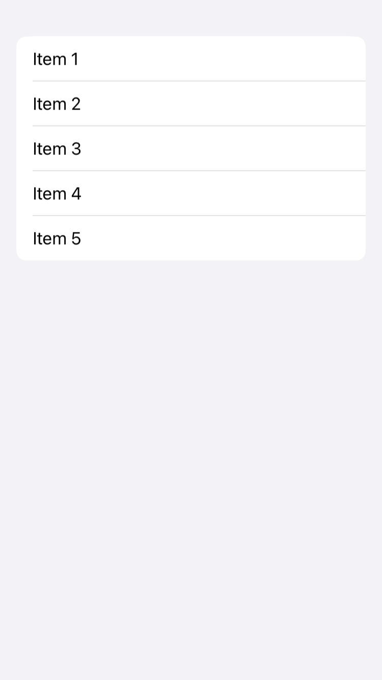
List is a container that presents rows of data arranged in a single column, similar to UITableView in UIKit but with a more declarative and simpler syntax. It’s commonly used for displaying a collection of items in a structured format and supports features like selection, deletion, and reordering of items if needed.
Parameters:
listStyle (optional) This parameter determines the horizontal alignment of the views within the VStack. It’s of type HorizontalAlignment and can take the following values:
automaticThe standard or default list style that automatically adapts to the current platform or theme.plainA simple, plain style that does not show separators between rows by default and does not indent rows.groupedThis style groups items in sections, similar to the grouped style in UIKit’s UITableView. It’s often used with a Section view to create distinct groups of items.insetProvides an inset appearance to the list, with margins on the sides, giving it a card-like feel.insetGroupedCombines the inset style with grouped sections, offering a modern look with background and spacing around grouped items.sidebarOptimized for use in sidebars, particularly in macOS or iPadOS apps, where the list acts as a navigation pane.
Default value:
automatic
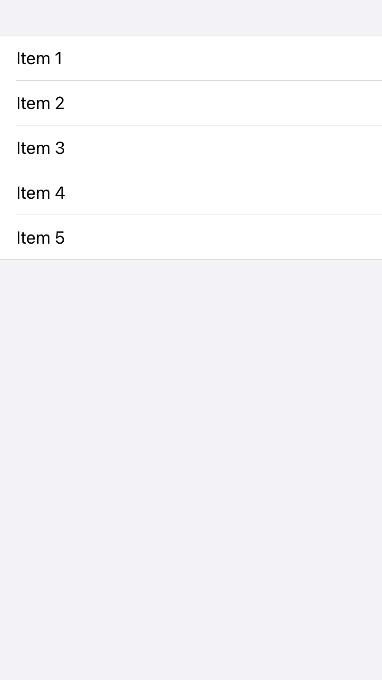
<body>
  <list>
    <text>Item 1</text>
    <text>Item 2</text>
    <text>Item 3</text>
    <text>Item 4</text>
    <text>Item 5</text>
  </list>
</body>
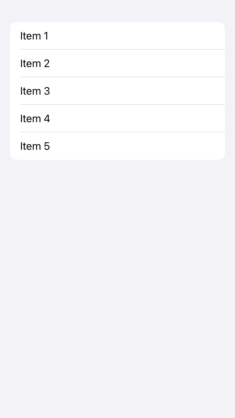
grouped List
<body>
  <list listStyle="grouped">
    <text>Item 1</text>
    <text>Item 2</text>
    <text>Item 3</text>
    <text>Item 4</text>
    <text>Item 5</text>
  </list>
</body>

insetGrouped List
<body>
  <list listStyle="insetGrouped">
    <text>Item 1</text>
    <text>Item 2</text>
    <text>Item 3</text>
    <text>Item 4</text>
    <text>Item 5</text>
  </list>
</body>
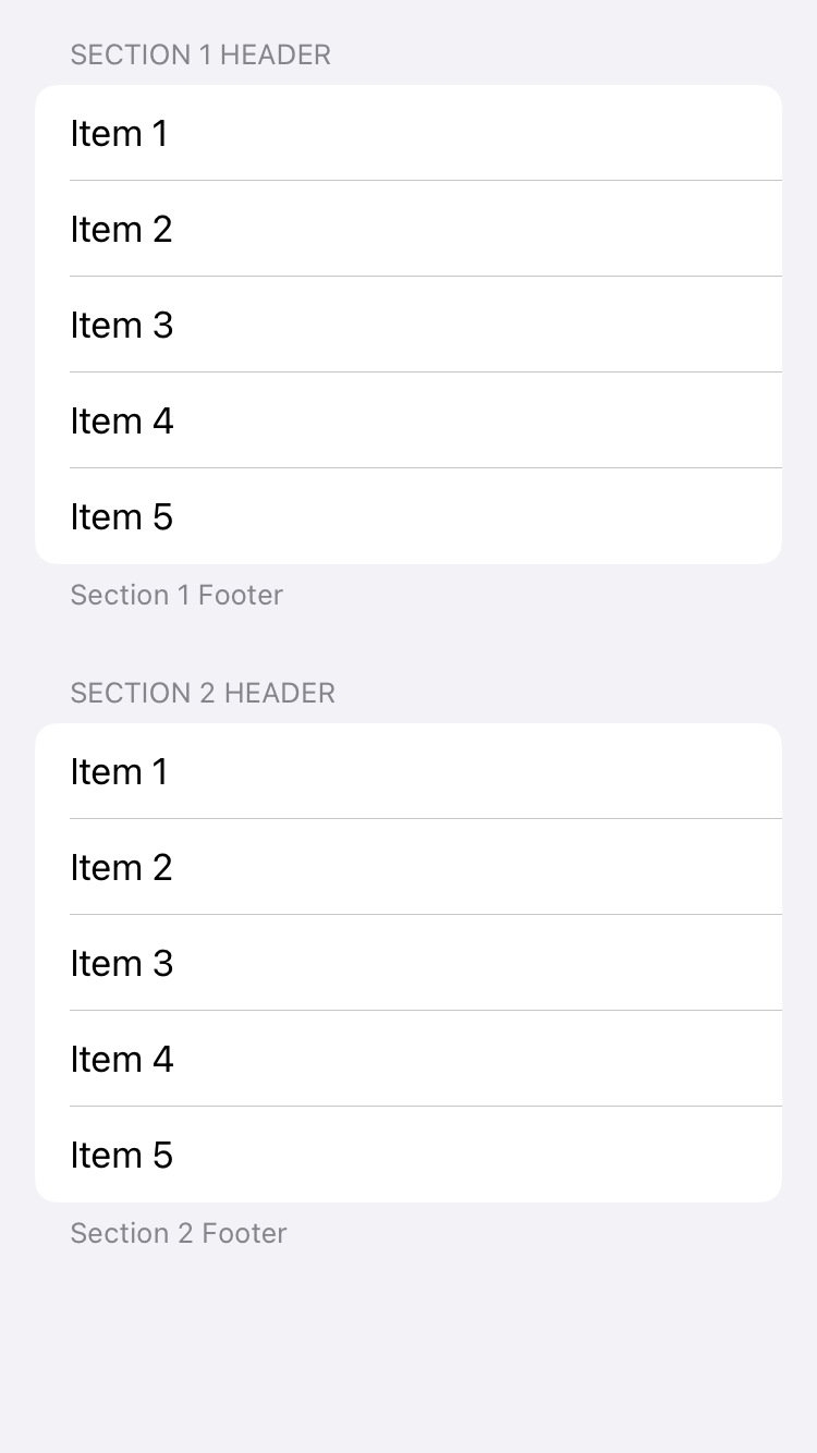
List with sections
<body>
  <list>
  	<section header="Section 1 Header" footer="Section 1 Footer">
    <text>Item 1</text>
    <text>Item 2</text>
    <text>Item 3</text>
    <text>Item 4</text>
    <text>Item 5</text>
    </section>

    <section header="Section 2 Header" footer="Section 2 Footer">
    <text>Item 1</text>
    <text>Item 2</text>
    <text>Item 3</text>
    <text>Item 4</text>
    <text>Item 5</text>
    </section>
  </list>
</body>

label
Label is a view that combines a text view with an icon view, providing a user interface element that can display both text and an image side by side. It is commonly used to represent actions, content, or to communicate the status of something in a concise and visually informative way.
Parameters:
systemImage (optional) Name of the SF symbol
name (optional) Name of image embedded in assets
Examples
<body>
  <form>
    <label>Label with no image</label>
    <label systemImage="car.fill">Label with system image</label>
    <label foregroundColor="orange" systemImage="car.fill">Label with system image</label>
    <label image="noob2-30x30">Label with custom image</label>
   </form>
</body>

Label with labelStyle
<body>
  <list padding="">
    <section footer="no labelStyle provided">
      <label systemImage="car.fill">Label title</label>
    </section>

    <section footer="labelStyle=automatic">
      <label labelStyle="automatic" systemImage="car.fill">Label title</label>
    </section>

    <section footer="labelStyle=automatic (with red color)">
      <label foregroundColor="red" labelStyle="automatic" systemImage="car.fill">Label title</label>
    </section>

    <section footer="labelStyle=iconOnly">
      <label labelStyle="iconOnly" systemImage="car.fill">Label title</label>
    </section>

    <section footer="labelStyle=titleOnly">
      <label labelStyle="titleOnly" systemImage="car.fill">Label title</label>
    </section>

    <section footer="labelStyle=titleAndIcon">
      <label labelStyle="titleAndIcon" systemImage="car.fill">Label title</label>
    </section>
   </list>
</body>

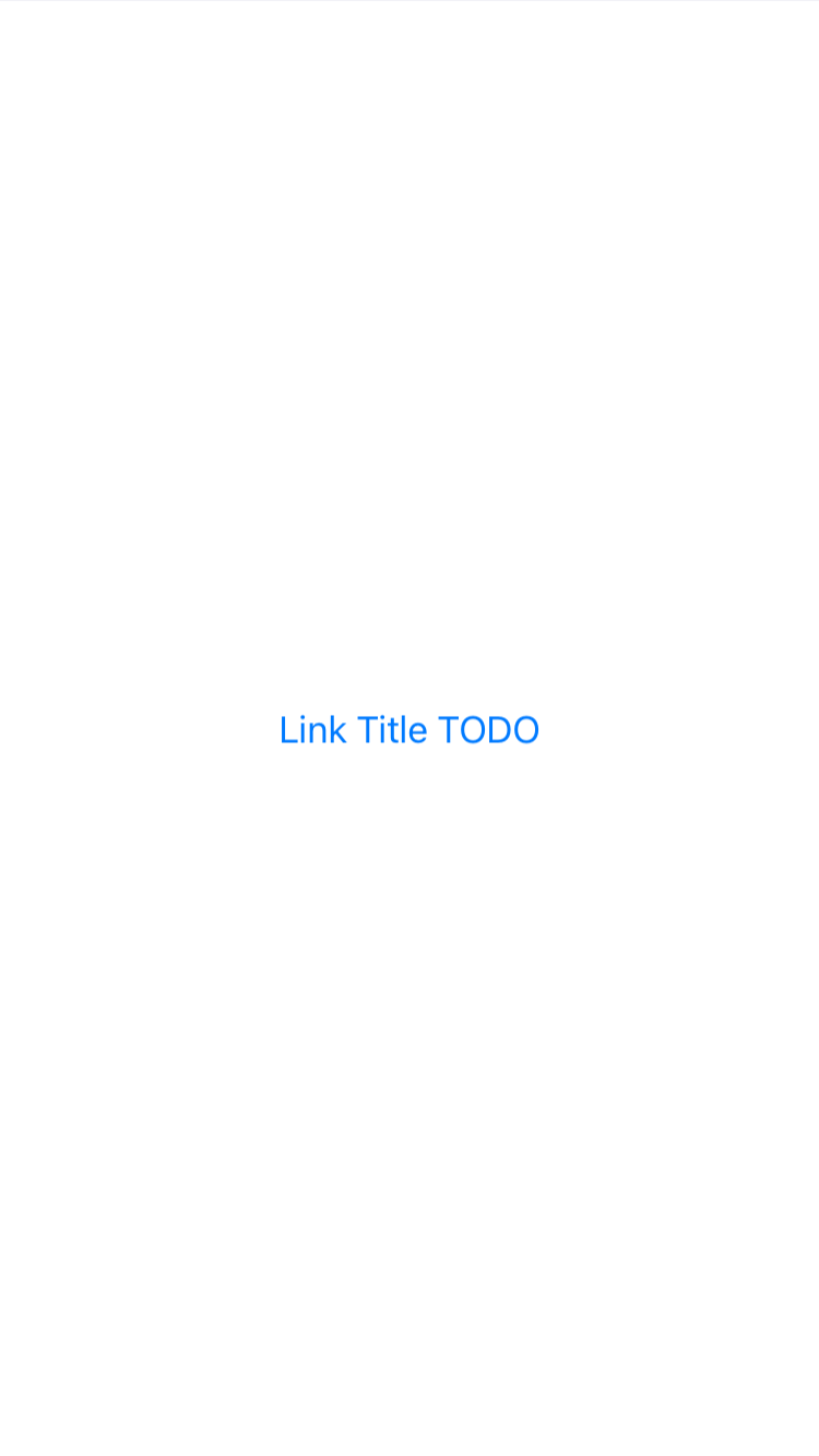
link
link is a view that creates a navigation link to a URL that you provide. It allows you to open web URLs or deep links into other apps from your SwiftUI app. When a user taps on a Link, the system opens the URL in the appropriate app. For web URLs, this typically means opening the URL in the default web browser.
<body>
    <link url="https://shaffex.github.io">Open URL</link>
</body>
list
List is a container that presents rows of data arranged in a single column, similar to UITableView in UIKit but with a more declarative and simpler syntax. It’s commonly used for displaying a collection of items in a structured format and supports features like selection, deletion, and reordering of items if needed.
Parameters:
listStyle (optional) This parameter determines the horizontal alignment of the views within the VStack. It’s of type HorizontalAlignment and can take the following values:
automaticThe standard or default list style that automatically adapts to the current platform or theme.plainA simple, plain style that does not show separators between rows by default and does not indent rows.groupedThis style groups items in sections, similar to the grouped style in UIKit’s UITableView. It’s often used with a Section view to create distinct groups of items.insetProvides an inset appearance to the list, with margins on the sides, giving it a card-like feel.insetGroupedCombines the inset style with grouped sections, offering a modern look with background and spacing around grouped items.sidebarOptimized for use in sidebars, particularly in macOS or iPadOS apps, where the list acts as a navigation pane.
Default value:
automatic
<body>
  <list>
    <text>Item 1</text>
    <text>Item 2</text>
    <text>Item 3</text>
    <text>Item 4</text>
    <text>Item 5</text>
  </list>
</body>

grouped List
<body>
  <list listStyle="grouped">
    <text>Item 1</text>
    <text>Item 2</text>
    <text>Item 3</text>
    <text>Item 4</text>
    <text>Item 5</text>
  </list>
</body>

insetGrouped List
<body>
  <list listStyle="insetGrouped">
    <text>Item 1</text>
    <text>Item 2</text>
    <text>Item 3</text>
    <text>Item 4</text>
    <text>Item 5</text>
  </list>
</body>

List with sections
<body>
  <list>
  	<section header="Section 1 Header" footer="Section 1 Footer">
    <text>Item 1</text>
    <text>Item 2</text>
    <text>Item 3</text>
    <text>Item 4</text>
    <text>Item 5</text>
    </section>

    <section header="Section 2 Header" footer="Section 2 Footer">
    <text>Item 1</text>
    <text>Item 2</text>
    <text>Item 3</text>
    <text>Item 4</text>
    <text>Item 5</text>
    </section>
  </list>
</body>
menu
List is a container that presents rows of data arranged in a single column, similar to UITableView in UIKit but with a more declarative and simpler syntax. It’s commonly used for displaying a collection of items in a structured format and supports features like selection, deletion, and reordering of items if needed.
Parameters:
listStyle (optional) This parameter determines the horizontal alignment of the views within the VStack. It’s of type HorizontalAlignment and can take the following values:
automaticThe standard or default list style that automatically adapts to the current platform or theme.plainA simple, plain style that does not show separators between rows by default and does not indent rows.groupedThis style groups items in sections, similar to the grouped style in UIKit’s UITableView. It’s often used with a Section view to create distinct groups of items.insetProvides an inset appearance to the list, with margins on the sides, giving it a card-like feel.insetGroupedCombines the inset style with grouped sections, offering a modern look with background and spacing around grouped items.sidebarOptimized for use in sidebars, particularly in macOS or iPadOS apps, where the list acts as a navigation pane.
Default value:
automatic
<body>
  <list>
    <text>Item 1</text>
    <text>Item 2</text>
    <text>Item 3</text>
    <text>Item 4</text>
    <text>Item 5</text>
  </list>
</body>
grouped List
<body>
  <list listStyle="grouped">
    <text>Item 1</text>
    <text>Item 2</text>
    <text>Item 3</text>
    <text>Item 4</text>
    <text>Item 5</text>
  </list>
</body>
insetGrouped List
<body>
  <list listStyle="insetGrouped">
    <text>Item 1</text>
    <text>Item 2</text>
    <text>Item 3</text>
    <text>Item 4</text>
    <text>Item 5</text>
  </list>
</body>

List with sections
<body>
  <list>
  	<section header="Section 1 Header" footer="Section 1 Footer">
    <text>Item 1</text>
    <text>Item 2</text>
    <text>Item 3</text>
    <text>Item 4</text>
    <text>Item 5</text>
    </section>

    <section header="Section 2 Header" footer="Section 2 Footer">
    <text>Item 1</text>
    <text>Item 2</text>
    <text>Item 3</text>
    <text>Item 4</text>
    <text>Item 5</text>
    </section>
  </list>
</body>

navigationlink
List is a container that presents rows of data arranged in a single column, similar to UITableView in UIKit but with a more declarative and simpler syntax. It’s commonly used for displaying a collection of items in a structured format and supports features like selection, deletion, and reordering of items if needed.
Parameters:
listStyle (optional) This parameter determines the horizontal alignment of the views within the VStack. It’s of type HorizontalAlignment and can take the following values:
automaticThe standard or default list style that automatically adapts to the current platform or theme.plainA simple, plain style that does not show separators between rows by default and does not indent rows.groupedThis style groups items in sections, similar to the grouped style in UIKit’s UITableView. It’s often used with a Section view to create distinct groups of items.insetProvides an inset appearance to the list, with margins on the sides, giving it a card-like feel.insetGroupedCombines the inset style with grouped sections, offering a modern look with background and spacing around grouped items.sidebarOptimized for use in sidebars, particularly in macOS or iPadOS apps, where the list acts as a navigation pane.
Default value:
automatic
<body>
  <list>
    <text>Item 1</text>
    <text>Item 2</text>
    <text>Item 3</text>
    <text>Item 4</text>
    <text>Item 5</text>
  </list>
</body>

grouped List
<body>
  <list listStyle="grouped">
    <text>Item 1</text>
    <text>Item 2</text>
    <text>Item 3</text>
    <text>Item 4</text>
    <text>Item 5</text>
  </list>
</body>

insetGrouped List
<body>
  <list listStyle="insetGrouped">
    <text>Item 1</text>
    <text>Item 2</text>
    <text>Item 3</text>
    <text>Item 4</text>
    <text>Item 5</text>
  </list>
</body>

List with sections
<body>
  <list>
  	<section header="Section 1 Header" footer="Section 1 Footer">
    <text>Item 1</text>
    <text>Item 2</text>
    <text>Item 3</text>
    <text>Item 4</text>
    <text>Item 5</text>
    </section>

    <section header="Section 2 Header" footer="Section 2 Footer">
    <text>Item 1</text>
    <text>Item 2</text>
    <text>Item 3</text>
    <text>Item 4</text>
    <text>Item 5</text>
    </section>
  </list>
</body>

navigationstack
List is a container that presents rows of data arranged in a single column, similar to UITableView in UIKit but with a more declarative and simpler syntax. It’s commonly used for displaying a collection of items in a structured format and supports features like selection, deletion, and reordering of items if needed.
Parameters:
listStyle (optional) This parameter determines the horizontal alignment of the views within the VStack. It’s of type HorizontalAlignment and can take the following values:
automaticThe standard or default list style that automatically adapts to the current platform or theme.plainA simple, plain style that does not show separators between rows by default and does not indent rows.groupedThis style groups items in sections, similar to the grouped style in UIKit’s UITableView. It’s often used with a Section view to create distinct groups of items.insetProvides an inset appearance to the list, with margins on the sides, giving it a card-like feel.insetGroupedCombines the inset style with grouped sections, offering a modern look with background and spacing around grouped items.sidebarOptimized for use in sidebars, particularly in macOS or iPadOS apps, where the list acts as a navigation pane.
Default value:
automatic
<body>
  <list>
    <text>Item 1</text>
    <text>Item 2</text>
    <text>Item 3</text>
    <text>Item 4</text>
    <text>Item 5</text>
  </list>
</body>

grouped List
<body>
  <list listStyle="grouped">
    <text>Item 1</text>
    <text>Item 2</text>
    <text>Item 3</text>
    <text>Item 4</text>
    <text>Item 5</text>
  </list>
</body>

insetGrouped List
<body>
  <list listStyle="insetGrouped">
    <text>Item 1</text>
    <text>Item 2</text>
    <text>Item 3</text>
    <text>Item 4</text>
    <text>Item 5</text>
  </list>
</body>

List with sections
<body>
  <list>
  	<section header="Section 1 Header" footer="Section 1 Footer">
    <text>Item 1</text>
    <text>Item 2</text>
    <text>Item 3</text>
    <text>Item 4</text>
    <text>Item 5</text>
    </section>

    <section header="Section 2 Header" footer="Section 2 Footer">
    <text>Item 1</text>
    <text>Item 2</text>
    <text>Item 3</text>
    <text>Item 4</text>
    <text>Item 5</text>
    </section>
  </list>
</body>

navigationview
List is a container that presents rows of data arranged in a single column, similar to UITableView in UIKit but with a more declarative and simpler syntax. It’s commonly used for displaying a collection of items in a structured format and supports features like selection, deletion, and reordering of items if needed.
Parameters:
listStyle (optional) This parameter determines the horizontal alignment of the views within the VStack. It’s of type HorizontalAlignment and can take the following values:
automaticThe standard or default list style that automatically adapts to the current platform or theme.plainA simple, plain style that does not show separators between rows by default and does not indent rows.groupedThis style groups items in sections, similar to the grouped style in UIKit’s UITableView. It’s often used with a Section view to create distinct groups of items.insetProvides an inset appearance to the list, with margins on the sides, giving it a card-like feel.insetGroupedCombines the inset style with grouped sections, offering a modern look with background and spacing around grouped items.sidebarOptimized for use in sidebars, particularly in macOS or iPadOS apps, where the list acts as a navigation pane.
Default value:
automatic
<body>
  <list>
    <text>Item 1</text>
    <text>Item 2</text>
    <text>Item 3</text>
    <text>Item 4</text>
    <text>Item 5</text>
  </list>
</body>

grouped List
<body>
  <list listStyle="grouped">
    <text>Item 1</text>
    <text>Item 2</text>
    <text>Item 3</text>
    <text>Item 4</text>
    <text>Item 5</text>
  </list>
</body>

insetGrouped List
<body>
  <list listStyle="insetGrouped">
    <text>Item 1</text>
    <text>Item 2</text>
    <text>Item 3</text>
    <text>Item 4</text>
    <text>Item 5</text>
  </list>
</body>

List with sections
<body>
  <list>
  	<section header="Section 1 Header" footer="Section 1 Footer">
    <text>Item 1</text>
    <text>Item 2</text>
    <text>Item 3</text>
    <text>Item 4</text>
    <text>Item 5</text>
    </section>

    <section header="Section 2 Header" footer="Section 2 Footer">
    <text>Item 1</text>
    <text>Item 2</text>
    <text>Item 3</text>
    <text>Item 4</text>
    <text>Item 5</text>
    </section>
  </list>
</body>

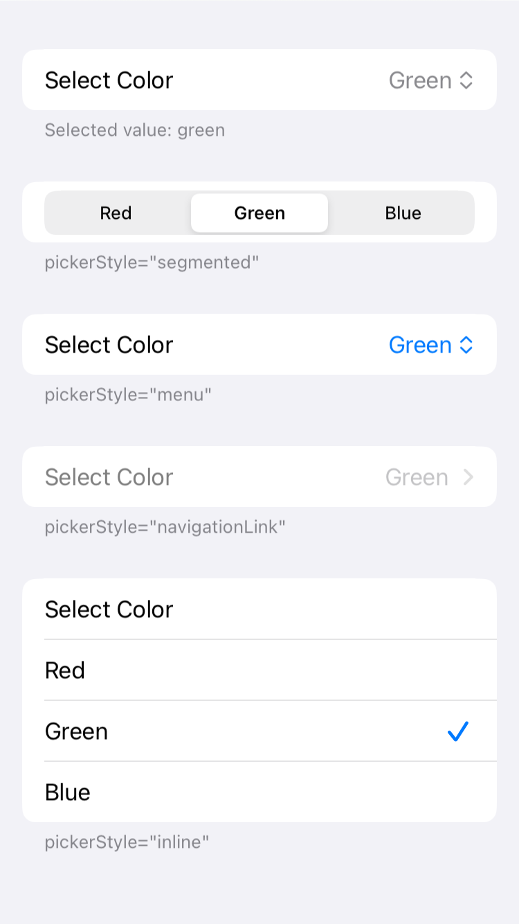
picker
Picker is a control used to select a value from a list of mutually exclusive values. It can be presented in various styles, such as a wheel, segmented control, or menu. The Picker is often used in forms or settings screens where users need to choose from a predefined set of options.
Parameters:
key Name of the variable that will store the selected value from the picker.
value Default selection value
title (optional) Picker title
Examples
<body>
<form>
<section footer="Selected value: $myPicker">
<picker title="Select Color" key="myPicker" value="green">My Toggle>
<text tag="red">Red</text>
<text tag="green">Green</text>
<text tag="nlue">Blue</text>
</picker>
</section>
<section footer="pickerStyle="segmented"">
<picker pickerStyle="segmented" title="Select Color" key="myPicker" value="green">My Toggle>
<text tag="red">Red</text>
<text tag="green">Green</text>
<text tag="blue">Blue</text>
</picker>
</section>
<section footer="pickerStyle="menu"">
<picker pickerStyle="menu" title="Select Color" key="myPicker" value="green">My Toggle>
<text tag="red">Red</text>
<text tag="green">Green</text>
<text tag="blue">Blue</text>
</picker>
</section>
<section footer="pickerStyle="navigationLink"">
<picker pickerStyle="navigationLink" title="Select Color" key="myPicker" value="green">My Toggle>
<text tag="red">Red</text>
<text tag="green">Green</text>
<text tag="blue">Blue</text>
</picker>
</section>
<section footer="pickerStyle="inline"">
<picker pickerStyle="inline" title="Select Color" key="myPicker" value="green">My Toggle>
<text tag="red">Red</text>
<text tag="green">Green</text>
<text tag="blue">Blue</text>
</picker>
</section>
</form>
</body>
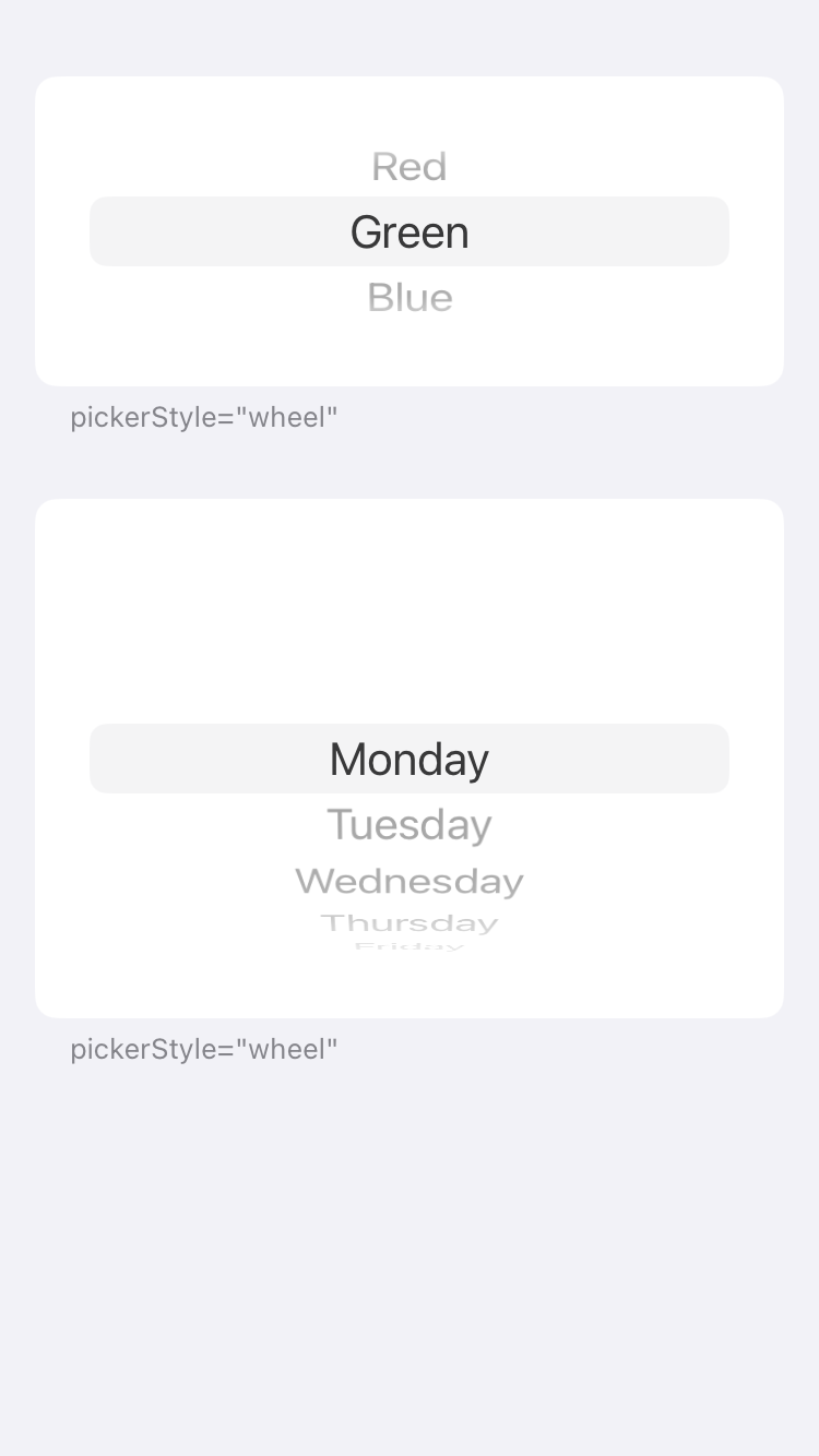
<body>
<form>
<section footer="pickerStyle="wheel"">
<picker height="120" pickerStyle="wheel" title="Select Color" key="myPicker" value="green">My Toggle>
<text tag="red">Red</text>
<text tag="green">Green</text>
<text tag="blue">Blue</text>
</picker>
</section>
<section footer="pickerStyle="wheel"">
<picker pickerStyle="wheel" title="Select Day" key="myPickerDay" value="Monday">My Toggle>
<text tag="Monday">Monday</text>
<text tag="Tuesday">Tuesday</text>
<text tag="Wednesday">Wednesday</text>
<text tag="Thursday">Thursday</text>
<text tag="Friday">Friday</text>
<text tag="Saturday">Saturday</text>
<text tag="Sunday">Sunday</text>
</picker>
</section>
</form>
</body>
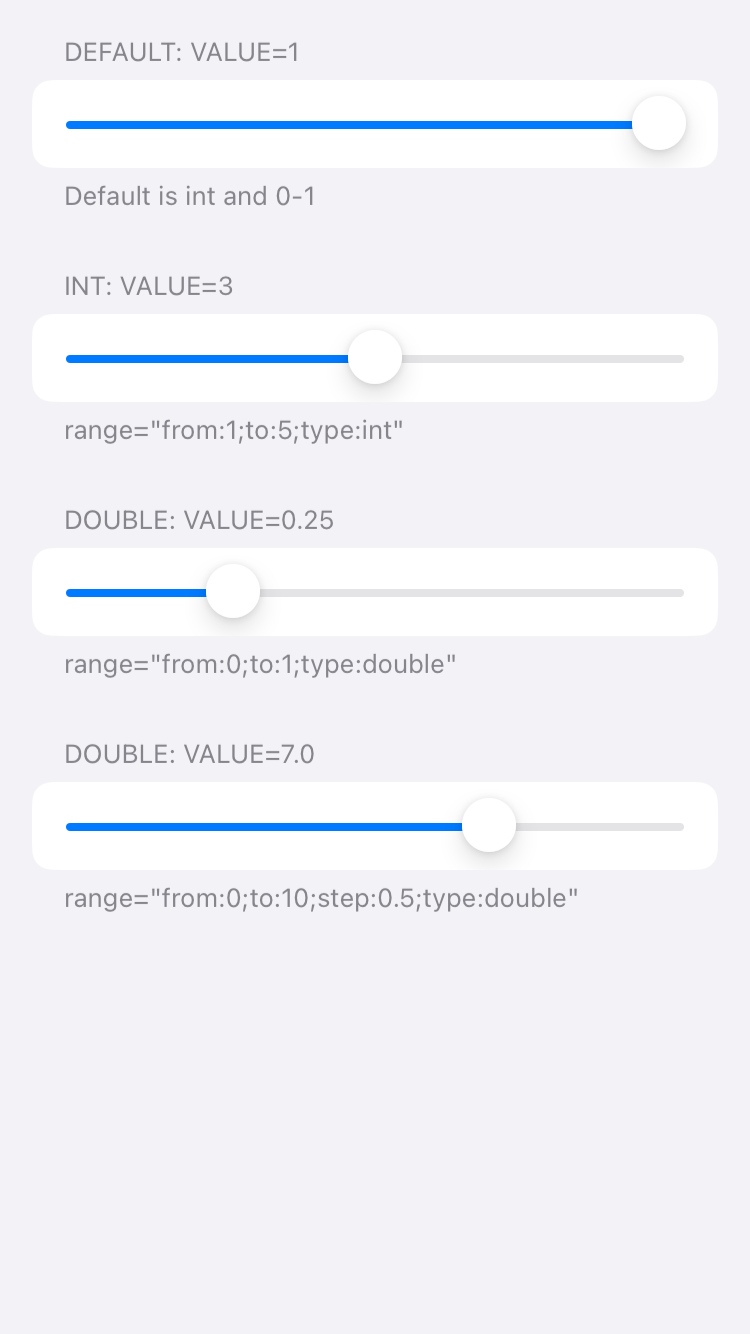
slider
Slider is a control that allows users to select a value from a continuous range by moving a thumb along a track. It is commonly used for adjusting numerical values in a user interface.
Parameters:
range (optional) Check code example for range values.
<body>
  <form>
    <section header="Default: Value=$mySlider" footer="Default is int and 0-1">
    <slider key="mySlider" value="1">Default Slider</slider>
    </section>

    <section header="Int: Value=$mySliderInt" footer='range="from:1;to:5;type:int"'>
    <slider key="mySliderInt" value="3" range="from:1;to:5;type:int">Int Slider</slider>
    </section>

    <section header="Double: Value=$mySliderDouble1" footer='range="from:0;to:1;type:double"'>
    <slider key="mySliderDouble1" value="0.25" range="from:0;to:1;type:double">Double Slider</slider>
    </section>

    <section header="Double: Value=$mySliderDouble2" footer='range="from:0;to:10;step:0.5;type:double"'>
    <slider key="mySliderDouble2" value="7" range="from:0;to:10;step:0.5;type:double">Double Slider</slider>
    </section>
  </form>
</body>
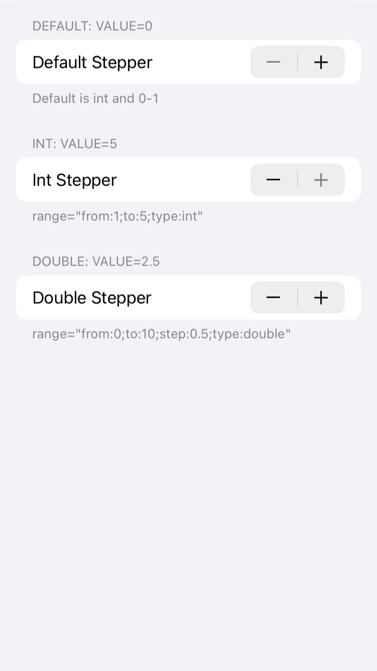
stepper
Stepper is a control that allows users to increment or decrement a value by tapping on a plus or minus button. It is commonly used for adjusting numerical values in a user interface.
Parameters:
range (optional) Check code example for range values.
<body>
  <form>
    <section header="Default: Value=$myStepper" footer="Default is int and 0-1">
    <stepper key="myStepper" value="1">Default Stepper</stepper>
    </section>

    <section header="Int: Value=$myStepperInt" footer='range="from:1;to:5;type:int"'>
    <stepper key="myStepperInt" value="3" range="from:1;to:5;type:int">Int Stepper</stepper>
    </section>

    <section header="Double: Value=$myStepperDouble" footer='range="from:0;to:10;step:0.5;type:double"'>
    <stepper key="myStepperDouble" value="3" range="from:0;to:10;step:0.5;type:double">Double Stepper</stepper>
    </section>
  </form>
</body>
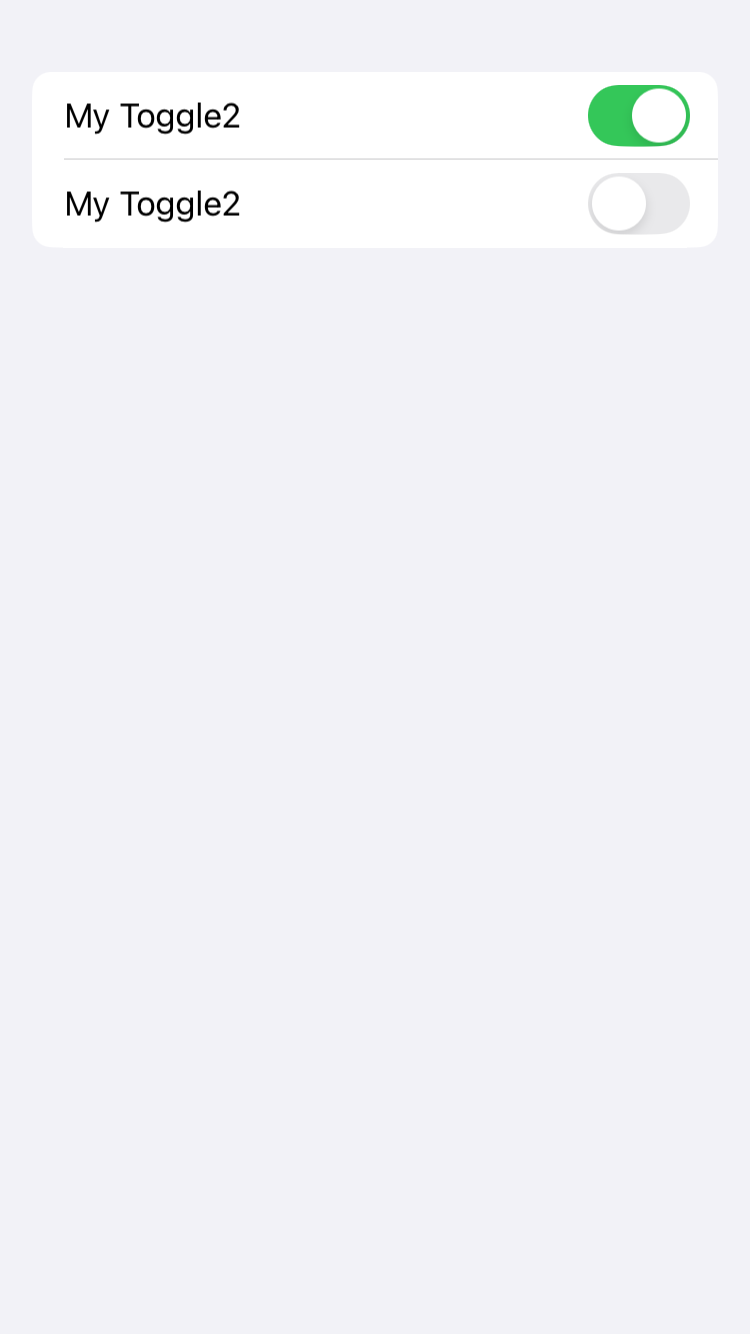
toggle
In SwiftUI, a Toggle is a control that allows users to toggle between a true or false state. It is visually represented as a switch that users can tap or swipe to change its state. The Toggle view takes a binding to a Boolean value, which it updates according to the user’s interaction. It also requires a label, which is typically used to describe the purpose of the toggle.
My Toggle
<body>
  <form>
    <toggle key="myToggle" value="true">My Toggle2</toggle>
    <toggle key="myToggle2" value="false">My Toggle2</toggle>
   </form>
</body>
Layout
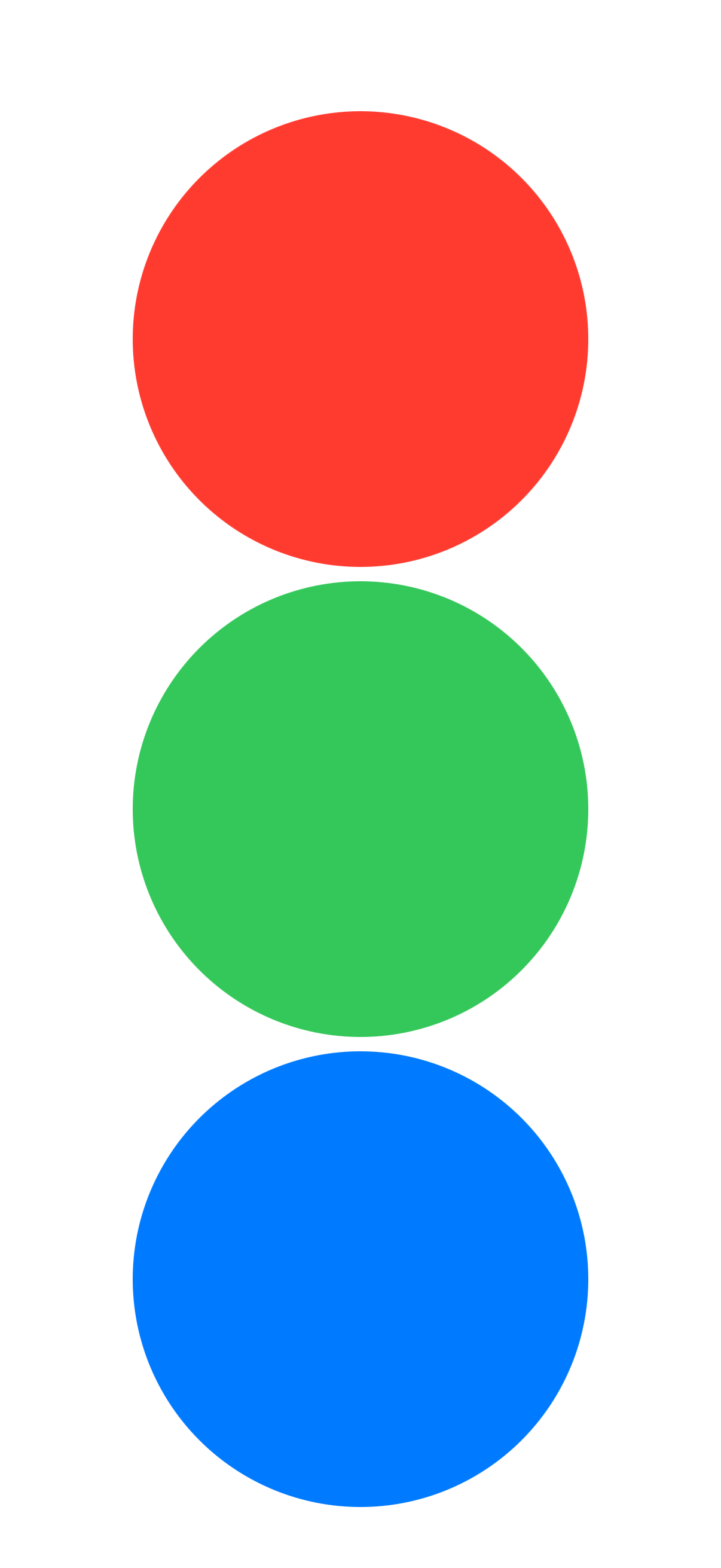
vstack
VStac is a view that arranges its children in a vertical line. The alignment parameter determines how the views are aligned horizontally.
Parameters:
alignment (optional) This parameter determines the horizontal alignment of the views within the VStack. It’s of type HorizontalAlignment and can take the following values:
leadingAligns the views along the leading edge, which is the left edge in left-to-right languages like English.centerAligns the views along the center.trailingAligns the views along the trailing edge, which is the right edge in left-to-right languages.
Default value: center
spacing (optional) This parameter determines the vertical spacing between the views.
Default value: System default spacing
Examples
<body>
    <vstack>
        <circle foregroundColor="red"/>
        <circle foregroundColor="green"/>
        <circle foregroundColor="blue"/>
    </vstack>
</body>
With no spacing
<body>
  <vstack spacing="0">
      <rectangle foregroundColor="red"/>
      <rectangle foregroundColor="green"/>
      <rectangle foregroundColor="blue"/>
  </vstack>
</body>

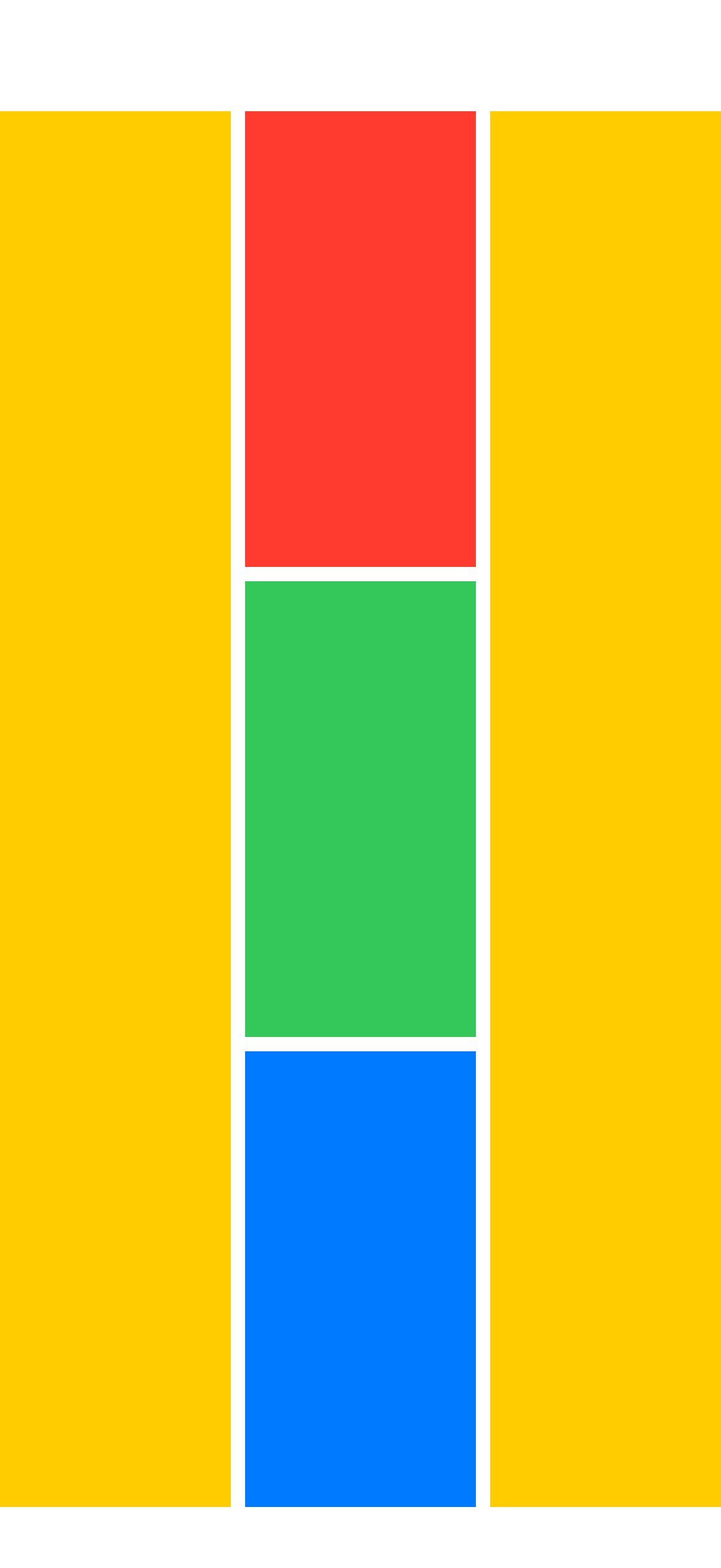
Combined with hstack
<body>
  <hstack>
      <rectangle foregroundColor="yellow"/>
      <vstack>
          <rectangle foregroundColor="red"/>
          <rectangle foregroundColor="green"/>
          <rectangle foregroundColor="blue"/>
      </vstack>
      <rectangle foregroundColor="yellow"/>
  </hstack>
</body>
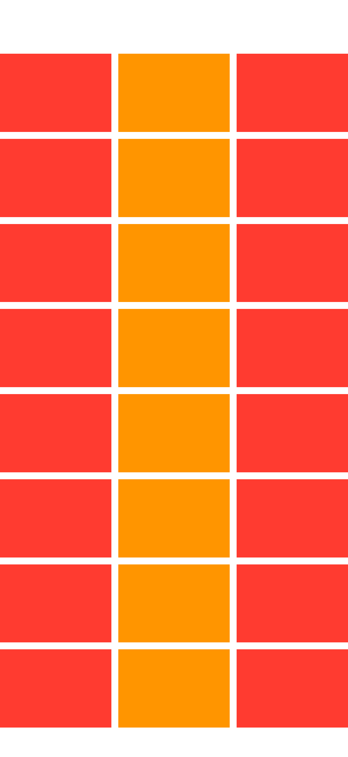
Combined with hstack
<body>
    <foreach repeatCount="8">
    <hstack>
        <rectangle foregroundColor="red"/>
        <rectangle foregroundColor="orange"/>
        <rectangle foregroundColor="red"/>
    </hstack>
    </foreach>
</body>
hstack
HStack is a view that arranges its children in a horizontal line. The alignment parameter determines how the views are aligned vertically.
Parameters:
alignment (optional) This parameter determines the vertical alignment of the views within the HStack. It’s of type VerticalAlignment and can take the following values:
topAligns the views along the top edge.centerAligns the views along the center.bottomAligns the views along the bottom edge.firstTextBaselineAligns the first line of text in each view along a common baseline.lastTextBaselineAligns the last line of text in each view along a common baseline.
Default value: center
spacing (optional) This parameter determines the horizontal spacing between the views.
Default value: System default spacing
Examples
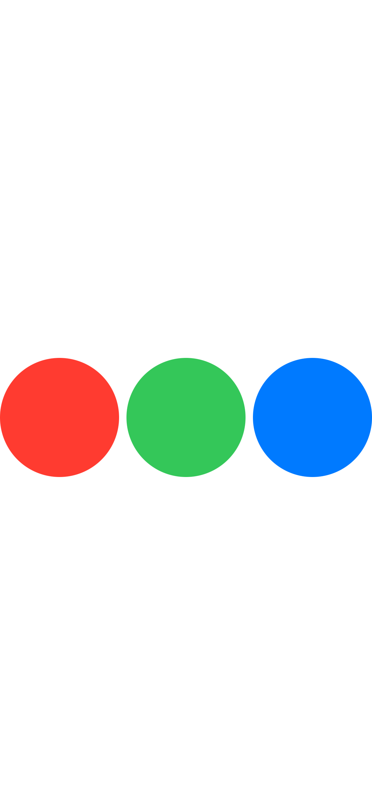
Hstack example
<body>
    <hstack>
        <circle foregroundColor="red"/>
        <circle foregroundColor="green"/>
        <circle foregroundColor="blue"/>
    </hstack>
</body>
<body>
  <hstack spacing="0">
      <rectangle foregroundColor="red"/>
      <rectangle foregroundColor="green"/>
      <rectangle foregroundColor="blue"/>
  </hstack>
</body>

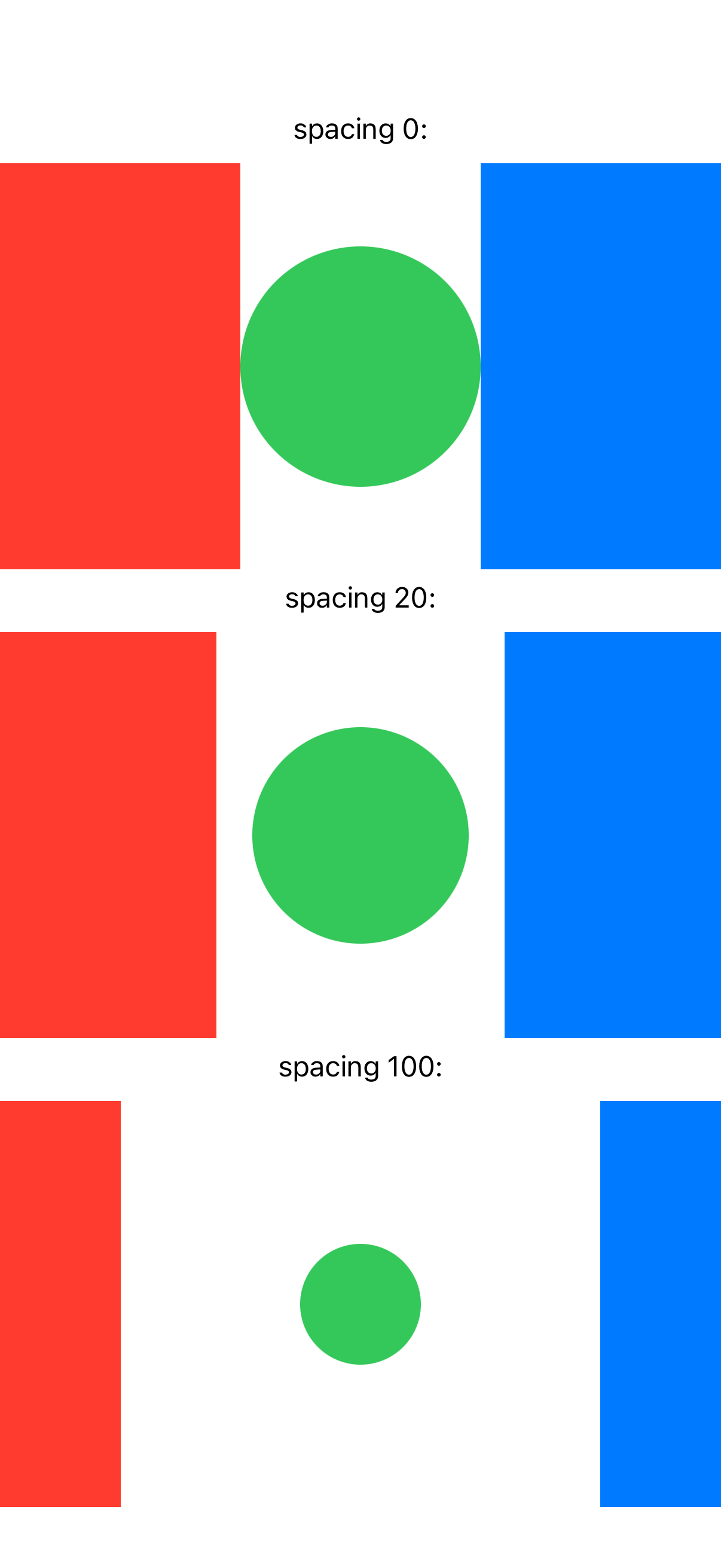
Example with various spacings
<body>
  <vstack>

  <text>spacing 0:</text>
  <hstack spacing="0">
    <rectangle foregroundColor="red"/>
      <circle foregroundColor="green"/>
      <rectangle foregroundColor="blue"/>
  </hstack>

  <text>spacing 20:</text>
  <hstack spacing="20">
    <rectangle foregroundColor="red"/>
    <circle foregroundColor="green"/>
    <rectangle foregroundColor="blue"/>
  </hstack>

  <text>spacing 100:</text>
  <hstack spacing="100">
    <rectangle foregroundColor="red"/>
    <circle foregroundColor="green"/>
    <rectangle foregroundColor="blue"/>
  </hstack>

  </vstack>
</body>
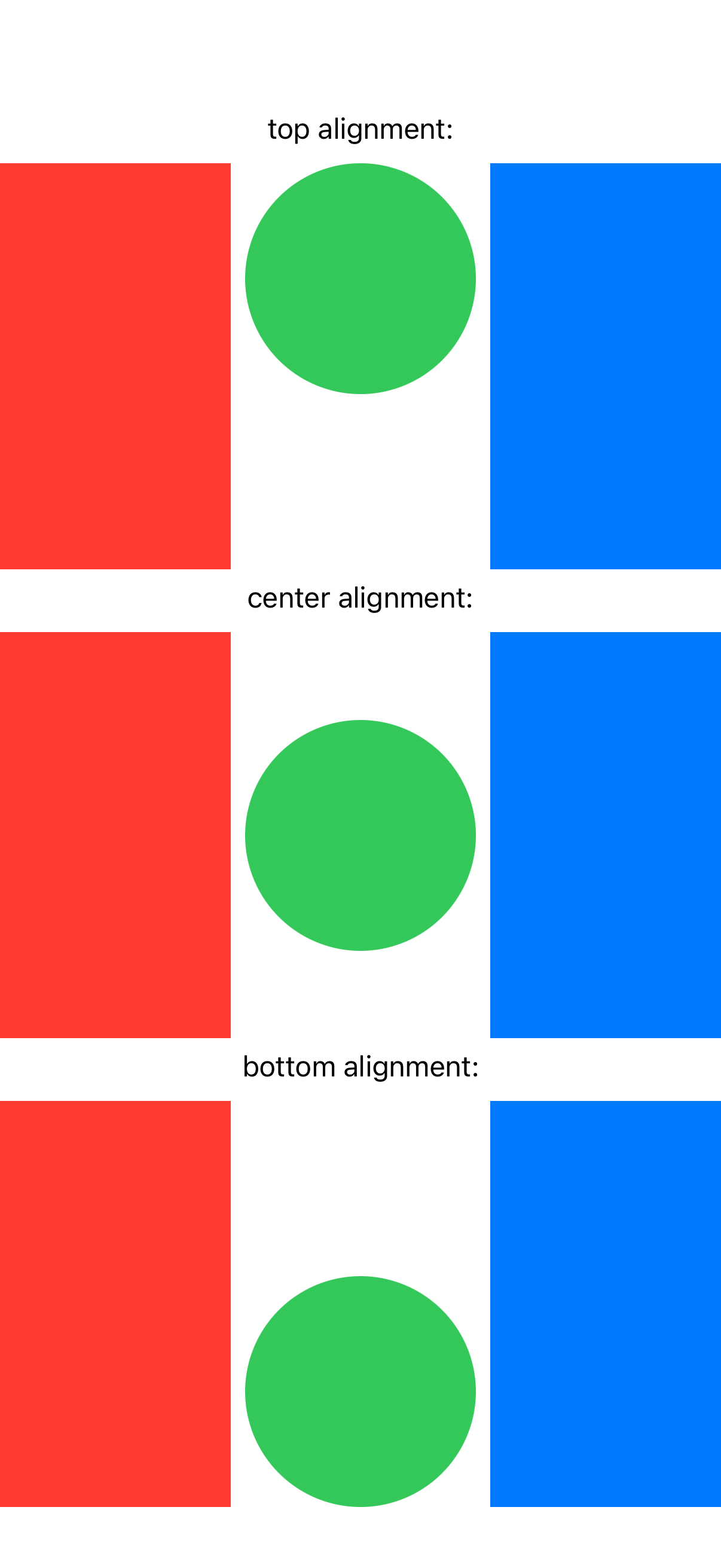
Example with various alignments
<body>
  <vstack>

  <text>top alignment:</text>
  <hstack alignment="top">
    <rectangle foregroundColor="red"/>
      <circle foregroundColor="green"/>
      <rectangle foregroundColor="blue"/>
  </hstack>

  <text>center alignment:</text>
  <hstack alignment="center">
    <rectangle foregroundColor="red"/>
    <circle foregroundColor="green"/>
    <rectangle foregroundColor="blue"/>
  </hstack>

  <text>bottom alignment:</text>
  <hstack alignment="bottom">
    <rectangle foregroundColor="red"/>
    <circle foregroundColor="green"/>
    <rectangle foregroundColor="blue"/>
  </hstack>

  </vstack>
</body>
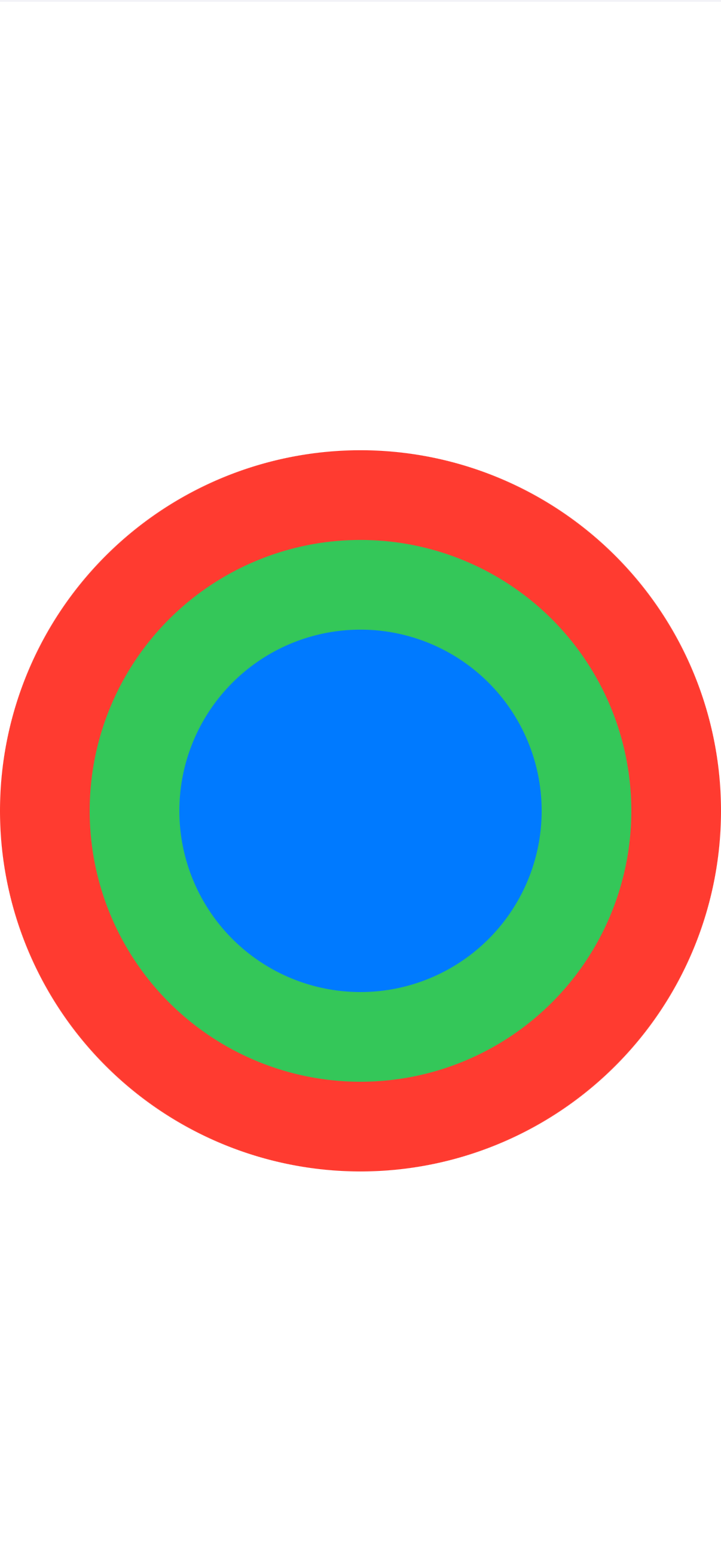
zstack
ZStack is a view that layers its children on top of each other, aligning them in both the horizontal and vertical axes. The alignment parameter determines how the views are aligned within the ZStack.
Parameters:
alignment (optional) This parameter determines the alignment of the views within the ZStack. It’s of type Alignment and can take the following values:
topLeadingAligns the views at the top leading corner.topAligns the views along the top edge.topTrailingAligns the views at the top trailing corner.leadingAligns the views along the leading edge, which is the left edge in left-to-right languages like English.centerAligns the views at the center.trailingAligns the views along the trailing edge, which is the right edge in left-to-right languages.bottomLeadingAligns the views at the bottom leading corner.bottomAligns the views along the bottom edge.bottomTrailingAligns the views at the bottom trailing corner.
Default value: center
Example with circles in zstack
<body>
    <zstack>
        <circle foregroundColor="red"/>
        <circle foregroundColor="green" padding="50"/>
        <circle foregroundColor="blue"  padding="100"/>
    </zstack>
</body>
lazyvgrid
LazyVGrid is a view that arranges its children in a grid with flexible vertical rows. The alignment and spacing parameters determine how the views are aligned and spaced.
Parameters:
alignment (optional) This parameter determines the horizontal alignment of the views within the LazyVGrid. It’s of type HorizontalAlignment and can take the following values:
leadingAligns the views along the leading edge, which is the left edge in left-to-right languages like English.centerAligns the views along the center.trailingAligns the views along the trailing edge, which is the right edge in left-to-right languages.Default value: center
spacing (optional) This parameter determines the vertical spacing between the rows in the grid.
Default value: System default spacing
columns (optional) This parameter determines the grid structure. It’s an array of GridItem objects that describe the layout of the grid’s columns.
gridItems (optional) This parameter determines the grid structure. It’s an array of GridItem objects that describe the layout of the grid’s columns.
adaptivetextminimummaximumspacingalignmentflexibletextfixedtext
Note: You need to specify columns or gridItems
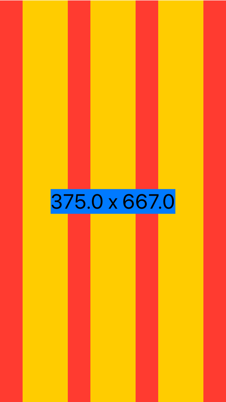
geometryreader
GeometryReader is a container view that provides access to the size and position of its child views. It allows you to read the geometry of the view hierarchy and use that information to adjust the layout dynamically.
<body>
<geometryreader proxy="geoProxy">

<zstack>
    <hstack spacing="0">

        <rectangle foregroundColor="red" width=""/>
        <rectangle foregroundColor="yellow" width=""/>
        <rectangle foregroundColor="red" width=""/>
        <rectangle foregroundColor="yellow" width=""/>
        <rectangle foregroundColor="red" width=""/>
        <rectangle foregroundColor="yellow" width=""/>
        <rectangle foregroundColor="red" width=""/>

    </hstack>

    <text font="largeTitle" background="blue">$geoProxy.width x $geoProxy.height</text>
</zstack>
</geometryreader>
</body>
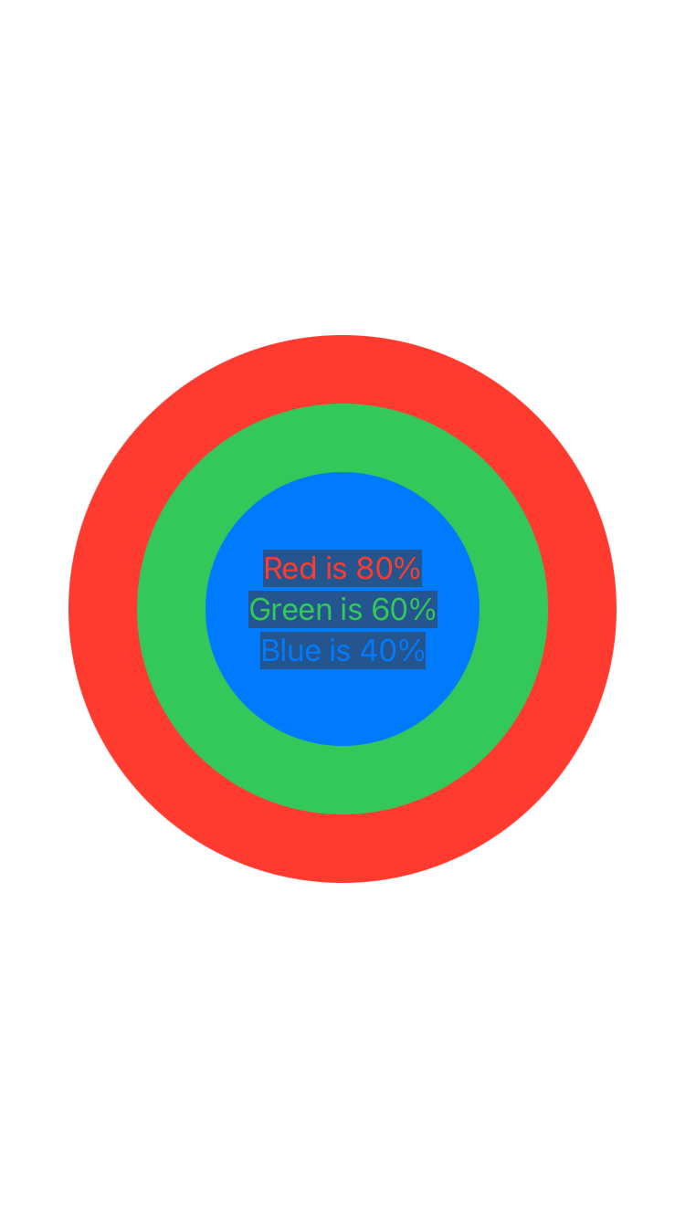
<body>
<geometryreader proxy="geoProxy">

<zstack maxWidth="infinity" maxHeight="infinity">
    <circle foregroundColor="red" width=""/>
    <circle foregroundColor="green" width=""/>
    <circle foregroundColor="blue" width=""/>

    <vstack alignment="bottomLeading">
        <text foregroundColor="red" background="secondary">Red is 80%</text>
        <text foregroundColor="green" background="secondary">Green is 60%</text>
        <text foregroundColor="blue" background="secondary">Blue is 40%</text>
    </vstack>
</zstack>
</geometryreader>
</body>
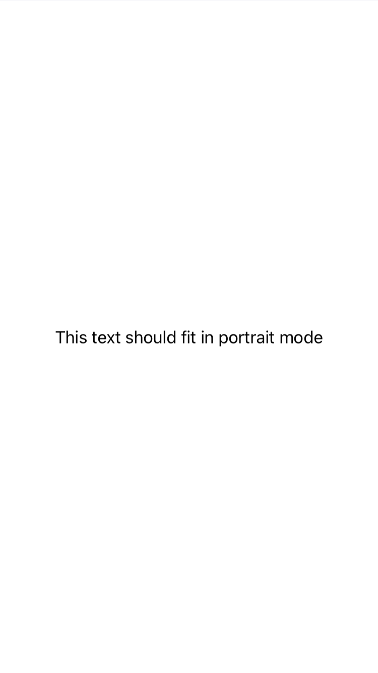
viewthatfits
ViewThatFits is a container view that attempts to fit its child views within the available space. It evaluates each child view in the order they are provided and displays the first one that fits within the constraints.
<body>
<viewthatfits>
    <text font="largeTitle">This text should fit in landscape mode</text>
    <text>This text should fit in portrait mode</text>
</viewthatfits>
</body>
Paint
lineargradient
LinearGradient in SwiftUI is a view that creates a linear gradient color transition over a specified direction or angle. It’s used to fill or overlay views with a gradient that shifts between two or more colors. The gradient can be customized to start and end at specific points, and you can control the direction of the color transition by specifying the start and end points.
Parameters:
gradient Observe the example to learn specifying colors, along with startPoint and endPoint for gradients. startPoint and endPoint utilize UnitPoint for positioning.
Examples
<body>
    <lineargradient gradient="colors:[red,green,blue];startPoint:0.0,0.5;endPoint:1.0,0.5">
    </lineargradient>
</body>
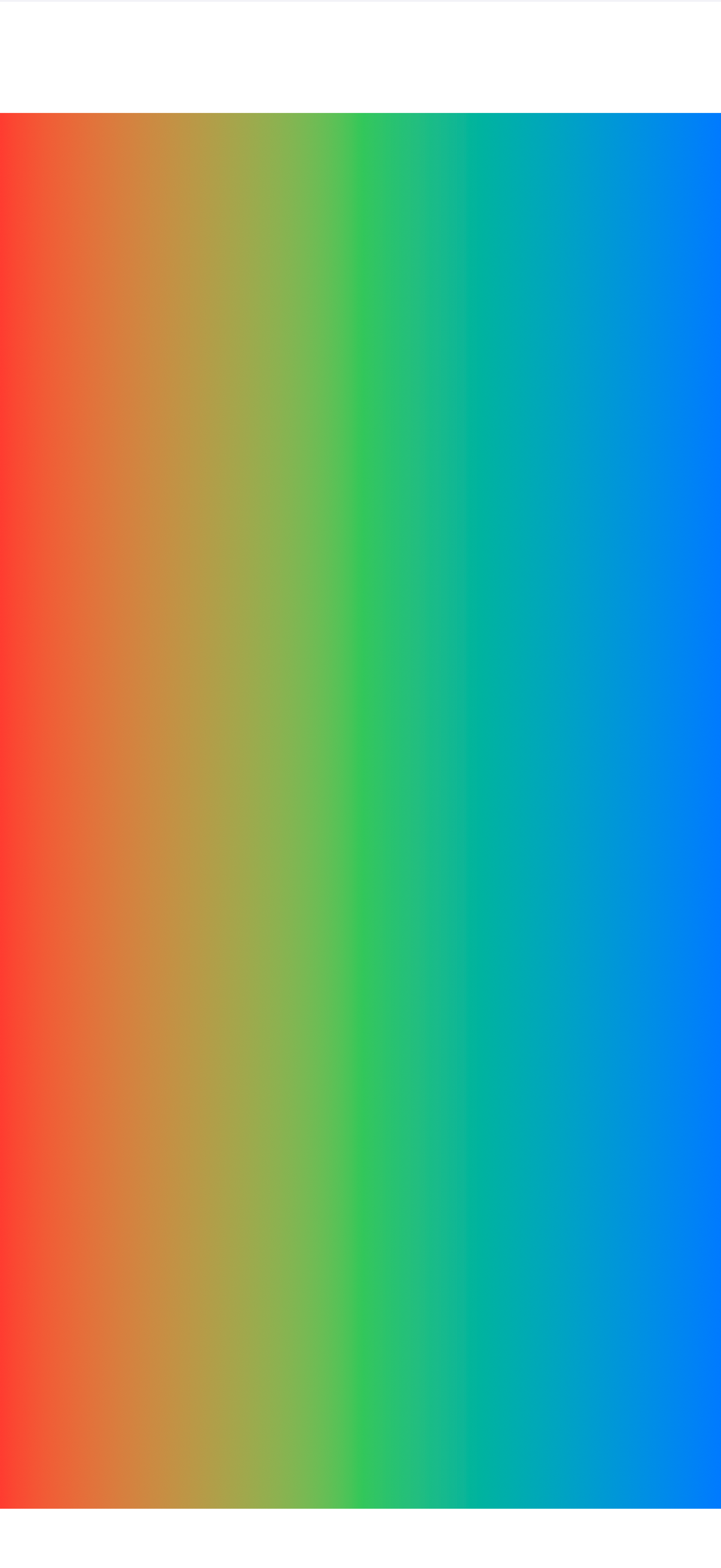
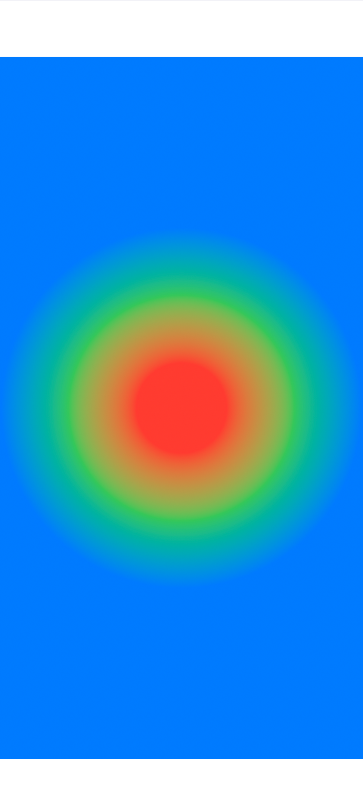
radialgradient
RadialGradient in SwiftUI is a view that creates a radial gradient color transition from an inner point to an outer circular shape. It’s used to fill or overlay views with a gradient that radiates from the center to the edges with two or more colors. The gradient can be customized by specifying the center, start radius, and end radius, allowing control over the gradient’s focal point and spread.
Parameters:
gradient See the example to understand how to specify colors, along with center, startRadius, and endRadius for radial gradients. The center is specified in UnitPoint for positioning, while startRadius and endRadius are specified in points to determine the gradient’s spread.
<body>
    <radialgradient gradient="colors:[red,green,blue];center:0.5,0.5;startRadius:50;endRadius:200">
    </radialgradient>
</body>
Other
contentunavailableview
ContentUnavailableView is a view that you can use to indicate that content is not available. This view is typically used when there is no data to display or when an error has occurred that prevents content from being shown. It provides a standardized way to inform users that the expected content cannot be displayed.
Parameters:
title Text view that provides the main message to the user.
description (optional) Text view that provides additional context or instructions.
systemImage (optional) An optional system Image view that can be used to visually represent the unavailability of content.
Examples
If no systemImage provided
<body>
  <contentunavailableview title="Title" description="Description">
  </contentunavailableview>
</body>

If no systemImage provided
<body>
  <contentunavailableview title="Title" description="Description" systemImage="exclamationmark.triangle">
  </contentunavailableview>
</body>

Custom
scrollingtext
ZStack is a container that overlays its children, aligning them in both axes.
<body>
    <vstack background="red">
    <scrollingtext>Scrolling text</scrollingtext>
    </vstack>
</body>

webview
ZStack is a container that overlays its children, aligning them in both axes.
<body>
    <webview xignoresSafeArea="" xopacity="0.5">string:b64:PGh0bWw+CiAgICA8aGVhZD4KICAgIAogICAgPG1ldGEgY2hhcnNldD0iVVRGLTgiPgogICAgPG1ldGEgbmFtZT0idmlld3BvcnQiIGNvbnRlbnQ9IndpZHRoPWRldmljZS13aWR0aCwgaW5pdGlhbC1zY2FsZT0xLjAiPgogICAgCiAgICAgICAgPHN0eWxlPgogICAgICAgICAgICBib2R5IHsKICBtYXJnaW46IDA7Cgp9CiAgICAgICAgPC9zdHlsZT4KCiAgICAgICAgCiAgICA8L2hlYWQ+CgogICAgCgogICAgPGNhbnZhcyBpZD0iY2FudiIvPgoKICAgIDxzY3JpcHQ+CiAgICAgICAgY29uc3QgY2FudmFzID0gZG9jdW1lbnQuZ2V0RWxlbWVudEJ5SWQoJ2NhbnYnKTsKY29uc3QgY3R4ID0gY2FudmFzLmdldENvbnRleHQoJzJkJyk7Cgpjb25zdCB3ID0gY2FudmFzLndpZHRoID0gZG9jdW1lbnQuYm9keS5vZmZzZXRXaWR0aDsKY29uc3QgaCA9IGNhbnZhcy5oZWlnaHQgPSBkb2N1bWVudC5ib2R5Lm9mZnNldEhlaWdodDsKY29uc3QgY29scyA9IE1hdGguZmxvb3IodyAvIDIwKSArIDE7CmNvbnN0IHlwb3MgPSBBcnJheShjb2xzKS5maWxsKDApOwoKY3R4LmZpbGxTdHlsZSA9ICcjMDAwJzsKY3R4LmZpbGxSZWN0KDAsIDAsIHcsIGgpOwoKZnVuY3Rpb24gbWF0cml4ICgpIHsKY3R4LmZpbGxTdHlsZSA9ICcjMDAwMSc7CmN0eC5maWxsUmVjdCgwLCAwLCB3LCBoKTsKCmN0eC5maWxsU3R5bGUgPSAnIzBmMCc7CmN0eC5mb250ID0gJzE1cHQgbW9ub3NwYWNlJzsKCnlwb3MuZm9yRWFjaCgoeSwgaW5kKSA9PiB7CmNvbnN0IHRleHQgPSBTdHJpbmcuZnJvbUNoYXJDb2RlKE1hdGgucmFuZG9tKCkgKiAxMjgpOwpjb25zdCB4ID0gaW5kICogMjA7CmN0eC5maWxsVGV4dCh0ZXh0LCB4LCB5KTsKaWYgKHkgPiAxMDAgKyBNYXRoLnJhbmRvbSgpICogMTAwMDApIHlwb3NbaW5kXSA9IDA7CmVsc2UgeXBvc1tpbmRdID0geSArIDIwOwp9KTsKfQoKc2V0SW50ZXJ2YWwobWF0cml4LCA1MCk7CiAgICA8L3NjcmlwdD4KCjwvaHRtbD4=</webview>
</body>

videoview
ZStack is a container that overlays its children, aligning them in both axes.
<body>
    <videoview src="url:https://shaffex.com/MagicUiDemo/Resources/TestVideo.mp4" videoGravity="resizeAspect"/>
</body>
